PEBBLEWRITER.COM IS LIVE!


*************** PEBBLEWRITER.COM IS LIVE! TO SIGN UP, CLICK HERE ***************


Showing posts with label bat. Show all posts

Wednesday, June 26, 2013

Update on Gold: Jun 26, 2013

reposted from pebblewriter.com~

It's been over a month since I last focused on gold.  The equities markets have kept me working overtime, and I assumed our May 15 forecast had long since jumped the tracks.

At the time, gold had plunged 270 to 1321 per ounce in only 4 sessions, bounced at 1321 (the day after our bottom call) to within 13 of our upside target, and was returning for a second bounce -- or not.   From that post [Update on Gold: May 15, 2013]:
Now, at 1373, it has reached a critical juncture that should result in either a sharp rally to 1560 or a plunge to 1141 in the coming month or so.
GC was closing in on the .786 retracement of the the rise off the 1321 bottom.  Playing the bounce was a low risk trade as long as one used trailing stops.
Long positions could be played from the .786 (1357) or .886 (1340) as long as stops are watched very carefully and updated frequently.
 The downside case is probably stronger.  If the current plunge continues past 1321, there are only a few key levels of support before things get really nasty:
  • horizontal support at 1302-1309
  • potential Fib targets of 1276 (the 1.272) or 1219 (1.618)
  • Fib support at 1141-1157
  • Fib support at 947
The bounce came a few days later at the .886 (1336) and despite gaining 84, couldn't clear the big white channel midline, much less the smaller red channel (white in previous charts) it had been in since last September.

When the big red channel from 1999 broke down on Jun 20, GC plunged again.  It failed to catch a bid at the first support level, but is approaching the second one this morning: the yellow 1.618 that completes the Crab Pattern at 1219.10.


This seems like an opportune time to update the forecast, as gold's price action continues to provide valuable clues as to investors' expectations about QE, the value of the dollar and inflation.  Are the many calls for gold to fall below $1000 per ounce well-founded?

Probably not.  We should get a decent bounce beginning at or near 1219 today that could take prices as high as 1320 or so by July 5-8.  A continued rally through the red midline would mean additional gains to 1357-1385 by mid-July.

But, there's a better chance of a plunge to 1155 instead -- and it need not respect the Crab Pattern about to complete, especially if today's equity rally falters (gold certainly isn't buying the More QE! snake oil.)

Remember that 1155 is the .618 retracement (in white below) of the huge rally from 681 in 2008 to last September's 1923 all-time high. Around July 15, the bottom of the big white channel and the bottom of the red channel intersect there with the bottom of the big purple channel (it replaced the red one that failed on Jun 20.)

This is the same price target we identified in our April 15 Update on Gold.
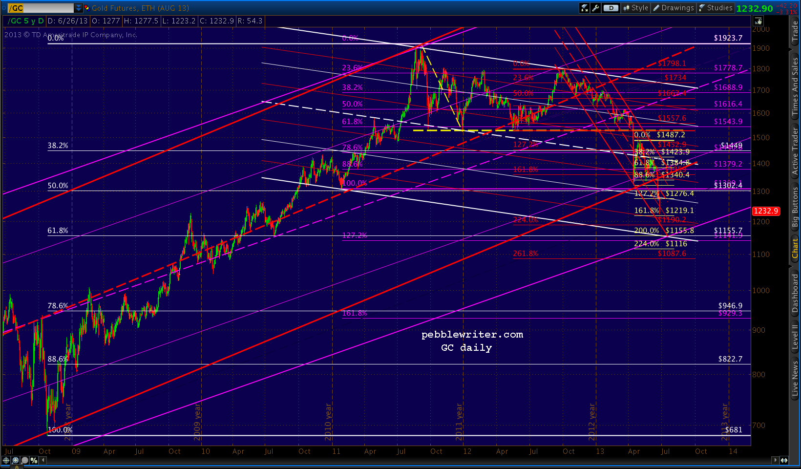

We can speculate about what circumstances might provide for a floor.  The prevailing wisdom these days is yet another round of QE -- or at least inflation of some variety. With interest rates on the rise, that seems likely enough.  We'll stick a pin in the idea of a mid-July market calamity that necessitates Fed intervention.

...continued on pebblewriter.com...

Thursday, April 25, 2013

The Best Laid Plans

The best laid plans of mice and men
Go often awry,
And leave us nothing but grief and pain,
For promised joy!
Robert Burns, 1785


ORIGINAL POST:  6:45 AM EDT

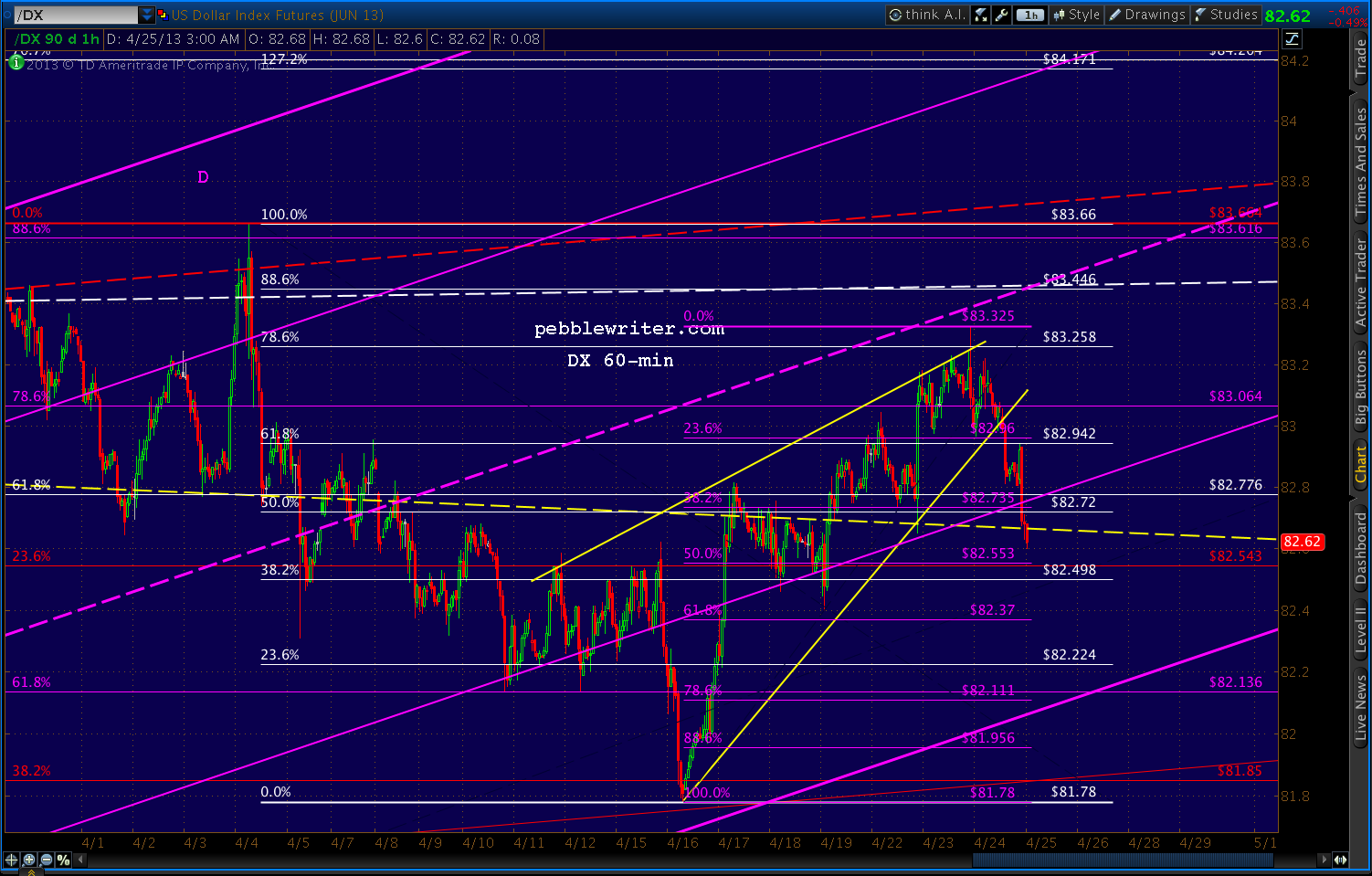
The wedges we've been watching on DX and EURUSD are playing out.  EURUSD has broken out...


...and DX has broken down.


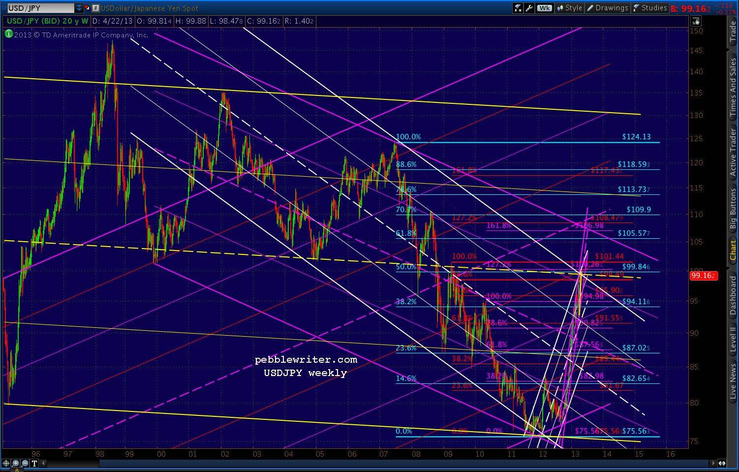
But, it's the USDJPY that I'm watching especially closely this morning.  It still hasn't broken 100 since our Apr 8 observation [USDJPY update] that it was running out of steam:
"...there is growing risk of a downturn as it approaches 100... it appears the pair might have hit at least interim resistance at today’s high."
It topped out 3 sessions later at 99.94, and two weeks later is in danger of a larger pullback.


Remember, weakening the yen was a critical element of the BOJ's stimulus program that was supposed to generate inflation, boost Toyota sales and send Japanese investment funds flooding into foreign markets.


Instead, Japanese investors are repatriating their funds from abroad -- a net Y9.5 trillion ($95 billion) since the first of the year.  Why?  As any US investor could tell you, QE might not inflate economies, but it sure as hell inflates markets.

The Nikkei 225 is up 65% since last October's lows....


...and, still hasn't even recovered 2/3 of its losses from the 2007 crash.  The Dow and the S&P 500, by contrast, have recovered all of them -- and, then some.  So, to many, the Nikkei still seems the better value.  It's hard to argue with success.

But, I'll do it anyway.  In reaching 14,020 a few hours ago, NKD tagged the .618 Fibonacci retracement of its 2007-2009 crash from 18,365 to 6990.


To those not familiar with harmonics, this tends to be a big deal.  When SPX reached the equivalent point in April 2010, it plunged 17%.  The DJIA fell almost 15%.  The USD, represented by DX, soared 9.3%.

But, the yen positively soared.  USDJPY started a 17-month slide that took the pair down 20% from 94.98 to 75.78.  NKD, which had just reached its .382 Fib, shed 23% over the next 4 months, eventually reaching almost 30% in Nov 2011.

Could the USDJPY's failure to break 100 be telling us something?  You better believe it.  I called a top a few weeks ago because the pair had reached several important Fib levels as well as the midline of an important channel (in yellow, below)...


...that dates back to 1995.


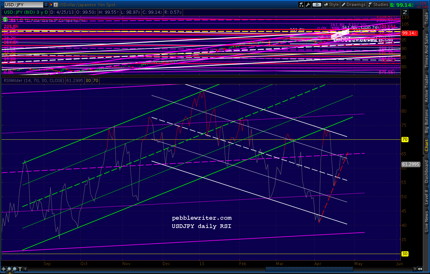
There's no guarantee it won't push through instead of retreating, but the RSI picture supports the danger of a significant retreat.

Daily RSI has backtested the broken yellow channel twice, but the trend is clearly down -- with the latest push being rebuffed by the purple midline.


And, a close-up reveals that a breakdown has already started.


Monday, April 15, 2013

Gold Melting Down

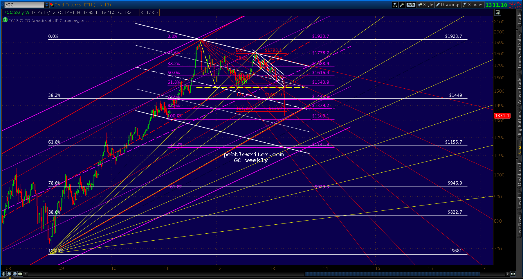
Gold continued to melt down today, shedding another $126 and continuing the plunge that started on Friday with the critical loss of the LT channel we discussed last week, the horizontal support at 1520-1535, and the psychologically important 1500 level.


Gold had a nice bounce from 1539 to 1590 after reaching the bottom of the channel and the horizontal support of several prior bounces on Apr 4.  In a dramatic demonstration of what can happen when channel support is lost, it has since shed almost $270/oz.

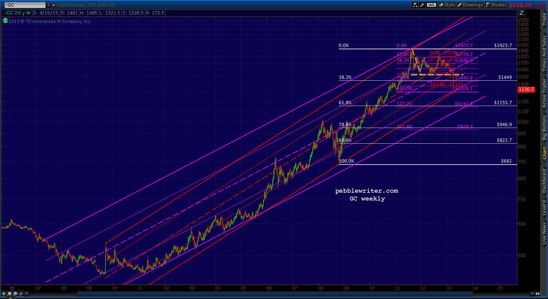
The red channel below represents my best shot at the new operative channel.  It supports the idea of a bounce at the Jan 2011 low of 1309 -- 3rd on our list of potential bounce spots during today's onslaught.
The next best available channel is well below the current one, but supports the idea of a bounce at 1379 or 1359 -- the Bat Pattern and Crab Pattern completions shown in the first chart above.  If those levels should fail to hold, the next major support levels are 1309 and 1155.
We got good bounces earlier today at the first two: the Fib retracements at 1359 and 1379  But, along came the CME with announcements of increased margins and that was the end of that.


Please note, I am not a gold bug.  I don't advocate the purchase of gold. I shy away from most assets that increase exponentially in price -- especially those backed with the kind of religious fervor as is gold.  They can drop with just as much enthusiasm.

The time may come when inflation is taking hold and it makes sense to switch everything you own into the metal... but, we're not there yet.  It's a crowded trade, and IMO, today's price action underscores the risk.

So, the following is offered in the same spirit as my picks for NCAA champion, Best Picture, and  Westminster Best in Show (the affenpinscher, really!?)

There's another channel (below, in purple) that kinda sorta supports the first, but shows the potential downside in the event that 1300 can't handle the pressure.


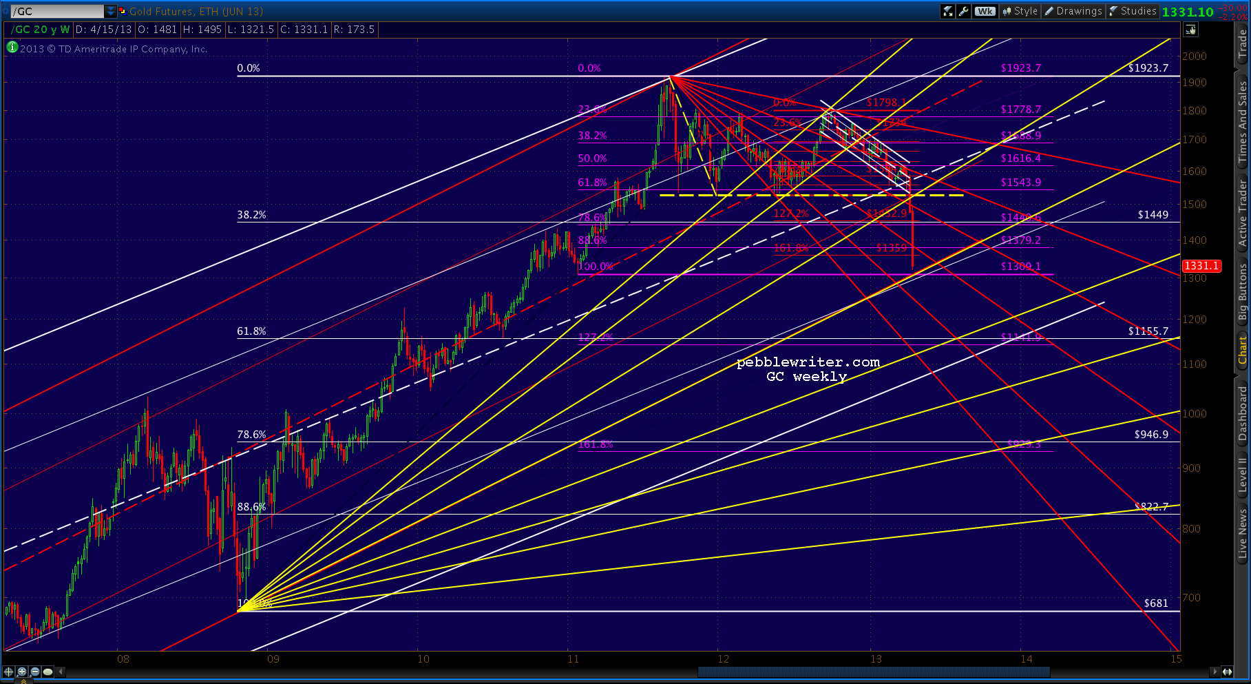
It's speculative, for sure.  But, I like the fact that it crosses the white .618 at a key point in time, so I'll leave it up for now.What's interesting to me is the Fibonacci Fans that can be drawn on this chart.  The ones from 681 low (yellow) have done a pretty decent job of guiding the bounces on the way down.


And, the ones from the 1923 high (red) have done well at halting several attempts at a breakout.


I could almost believe we've seen the worst of the drop, but I wonder about this potential channel...


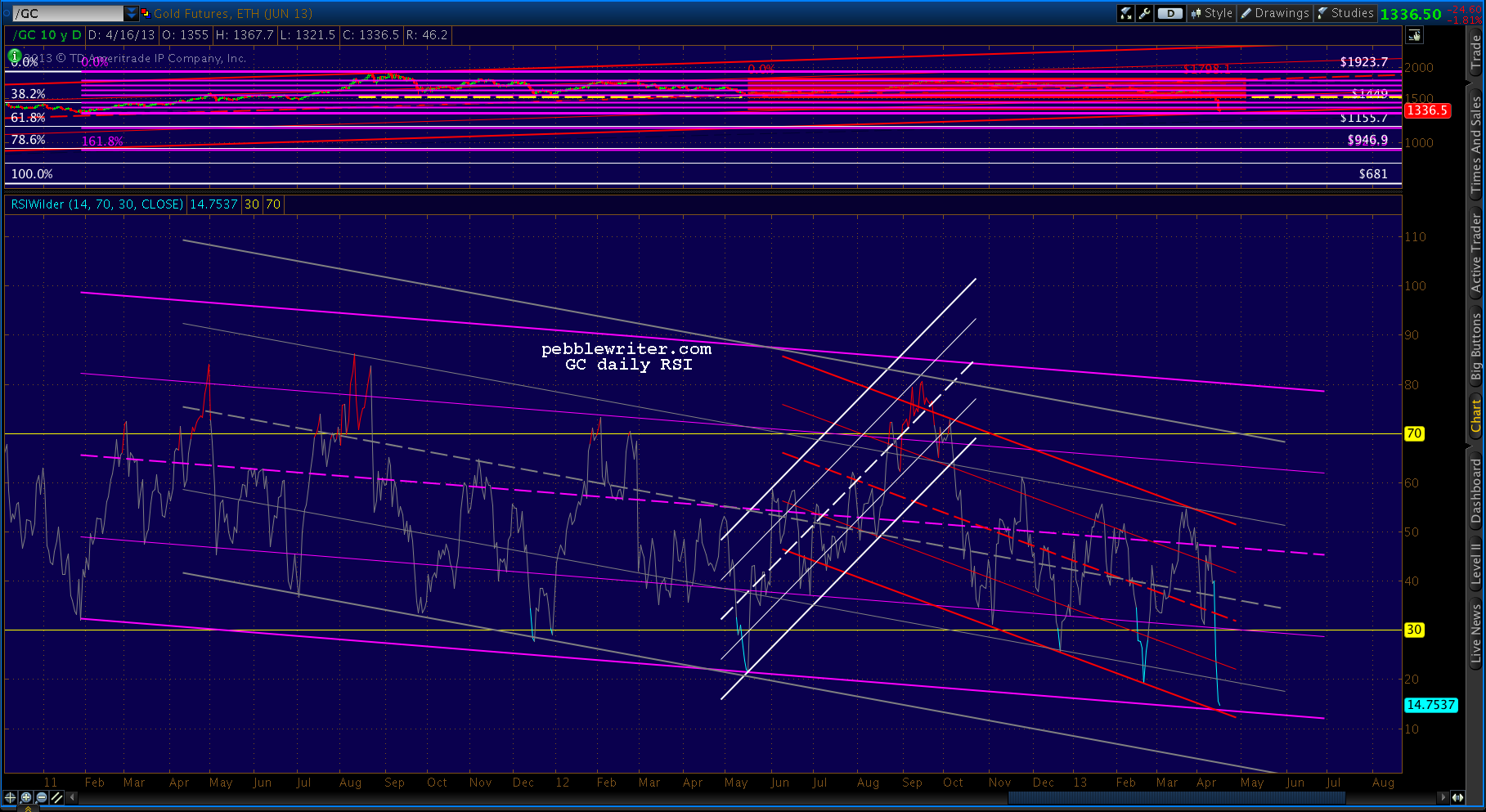
...and, the daily RSI -- which suggests at least a little more potential downside any way you slice it.  The bottom of the purple and red channels probably correlates to 1309, while the bottom of the gray channel represents something much more ominous.


So, where do we go from here?

continued on pebblewriter.com...

Friday, March 22, 2013

Anatomy of a Market Top

reposted from pebblewriter.com~

The 2000 top shows just how "messy" tops can be.  Here's the finished picture in perfect hind-sight.  It's a very crowded chart, but every single pattern had a say in how the top unfolded.

SPX had zoomed from 442 to 1478 in about 5 years, a not-too-shabby 234% gain for an annually compounded 27%.


Once SPX broke out of the falling purple channel, it had "permission" to pursue several harmonic patterns in the works.  SPX shot up 66 points in that one day -- blowing through every Fib level between .618 and 1.000.

It finally came to rest at 1458, completing a Bat Pattern at the purple .886.  But, the small white 1.272 was just above at 1477, as was the rising purple channel midline and the 1.272 from a much larger pattern seen below.

An IH&S target waited at 1497 - tantalizingly close to a nice round number of 1500.  And, the all-time high of 1478 from two months earlier beckoned.


SPX got up to 1477.33 before reacting, falling to 1466 over the next two days.  Close, but not quite.  Someone watching closely might have noticed the Flag Pattern it constructed, targeting 1562.  Someone else probably pointed out the biggest Crab Pattern target of all -- the 1.618 extension of the 13% correction from 1420 to 1233 from Jul-Oct 1999.

On Mar 21, 2000 SPX shot up through the channel midline, the cluster of Fibs around 1477 and, importantly, the 1478 high and raced up toward those higher targets.

On Mar 24, it reached 1552.87, which cleared the IH&S target at 1497, the purple 1.272 at 1519 and the last remaining Crab Pattern at 1535.  What ultimately stopped it?  The .75 line from the big purple channel dating back to Jul 1999 -- almost to the penny.

Total move: 17% and 227 points in 20 sessions.  Could it happen again?  Stay tuned.

*   *   *   *   *   *   *   * 

 Join pebblewriter.com, one of the most successful [see: results] new investment blogs on the planet, for daily in-depth market coverage, analysis and forecasts.  For more information, CLICK HERE.


Thursday, March 21, 2013

Charts I'm Watching: Mar 20, 2013

~reposted from pebblewriter.com:

9:00 AM EDT

The ECB's vow to do "whatever it takes"apparently translates into strong-arming the Russians into bailing out Cyprus.  Still no break out on the EURUSD, though.


It makes sense to play along with the upside on SPX, but keep stops close.  Not sure whether this rally will have legs.  The dollar looks like it's finding support here.


UPDATE:  09:33 AM

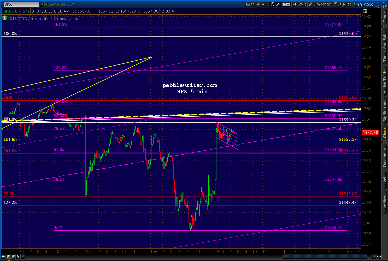
Just reached the .786 of the move down from 1563.62 (purple) and the .886 of our proposed path to 1576 (white.)  Full short again, stops at 1561ish.  Revised charts in a few...


UPDATE:  09:55 AM

The daily chart tells the story.  The most prominent features include:
  • large 1474-1343 Crab Pattern completion at 1555.57 (yellow)
  • large 1370-1074 Crab Pattern completion at 1553.39 (red)
  • small 1530-1485 Crab Pattern completion at 1559.32 (white)
  • small broken rising wedge -- at 1563 top
  • long-term TL and channel top (white) at 1560


UPDATE:  11:10 AM

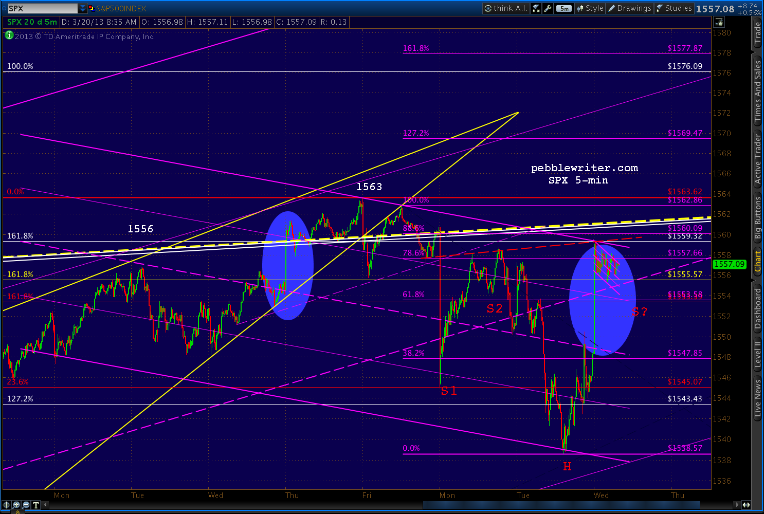
SPX continues to position itself for a run at 1576.  The 5-min chart shows a small potential Crab Pattern with a 1.618 at 1577 and a Flag Pattern targeting 1576.

It has broken back above and backtested the purple channel midline and retraced nearly .886 of its drop from 1562 and a little more than .786 of the drop from 1563.62.


While it's positioned for 1576, there is no more certainty than when we first broke 1555 on the Mar 14 overnight ramp job.  The large, bearish patterns listed above have still not produced the kind of sell-off they normally do.

And, it's all because of the Fed's media's cheerleaders' TPTB's determination to be able to tout a swell new all-time high for the S&P 500.

In addition to the little Crab Pattern (purple) that targets 1577 and the flag pattern targeting 1576, there's an obvious effort to construct an IH&S pattern targeting 1580.  It could benefit from a lower right shoulder, but bulls must beware of crossing back beneath the purple channel midline.


The S2 shoulder isn't quite legit, BTW, as the neckline doesn't quite connect on the left side.  But, the S1 shoulder is quite a ways down there.  So, if the pattern plays out, be prepared for some serious chop.

UPDATE:  1:00 PM

With the FOMC announcement a little over an hour away, let's resume our chat about the big picture.  If it seems like we're "lost in the reeds" as one reader so aptly put it, it's because we are.

The large Crab Pattern completions promised a good-sized dump last week at 1553/1555.  Instead we've inched higher.  Why?  These patterns completed in the middle of harmonic no-man's land: the gap between an .886 retracement and a double-top.

The .886 retracement (of the 1576-666 crash) produced a 9% reversal back on Sep 14.  Since then, SPX came screaming back to retake the 1576 all-time high -- but slammed into the Crab Patterns and a very important channel line along the way.

Now, it doesn't know what to do.

Double tops usually produce reversals, too -- sometimes meaningful ones as we found out on October 11, 2007, when SPX scooted up past the 1552 top from 2000 by a whopping 24 points before dropping 58%. 

The 2000 top itself shows just how "messy" tops can be.  Here's the finished picture in perfect hind-sight.  It's a very crowded chart, but every pattern on there had a say in how the top unfolded.


Once SPX broke out of the falling purple channel, it had "permission" to pursue several harmonic patterns in the works.  SPX shot up 66 points in that one day -- blowing through every Fib level between .618 and 1.000.

It finally came to rest at 1458, completing a Bat Pattern at the purple .886.  But, the small white 1.272 was just above at 1477, as was the rising purple channel midline and the 1.272 from a much larger pattern seen below.  An IH&S target waited at 1497 - tantalizingly close to the nice round number of 1500.  The all-time high of 1478 from two months earlier beckoned.


SPX got up to 1477.33 before reacting, falling to 1466 over the next two days.  Close, but not quite.  Someone watching closely might have noticed the Flag Pattern it constructed, targeting 1562.  Someone else probably pointed out the biggest Crab Pattern target of all -- the 1.618 extension of the 13% correction from 1420 to 1233 from Jul-Oct 1999.

I don't know what the catalyst was, but on Mar 21, 2000 (that date sounds awfully familiar) SPX shot up through the channel midline, the cluster of Fibs around 1477 and, importantly, the 1478 high and raced up toward those higher targets.

On Mar 24, it reached 1552.87, which cleared the IH&S target at 1497, the purple 1.272 at 1519 and the last remaining Crab Pattern at 1535.  What ultimately stopped it?  The .75 line from the big purple channel dating back to Jul 1999 -- almost to the penny.

Total move: 17% and 227 points in 20 sessions.  Could it happen again?

continued for members...

*   *   *   *   *   *   *   *

For full access to live market commentary throughout every trading day, subscribe to pebblewriter.com. 


Monday, March 18, 2013

Mad Men, Liars & Thieves

reposted from pebblewriter.com

It's hard to believe the numb nuts running the big show in the euro zone could be so stark-raving mad.  Raising taxes on countries with 25% unemployment seems positively brilliant compared to the idea of confiscating 10% of bank deposits -- especially those that are supposedly insured.

Get ready for the media interpreters who assure us "it's only Cyprus" --  which reminds me an awful lot of "it's only Bear Stearns" or "it's only Lehman."

The issue, of course, isn't the size of the depositor base in Cyprus banks.  It's the effect this action will have on depositors in Portugal, Spain and Italy.

 By now, even the most clueless depositors have to be wondering just how safe their deposits are.  The smart ones already know.  And, the brilliant ones moved their money a long time ago.

This bone-headed action also calls into question the ECB's willingness and/or ability to support troubled nations/banks.  If they can't float a lousy $13 billion to bail out Cyprus, how will they react when other, larger systemic risks pop back up?

And, last but certainly not least, what effect will this action have on the $700+ trillion derivatives market?  It's a spiders nest of complicated agreements whereby one party guarantees another that credit quality/interest rates/etc. won't slip past a certain level.

These private contracts are bought and sold countless times, to the point where no one usually knows the true exposure of any given player until it's too late.  When a bank fails, it's very difficult to discern how many counterparties will be affected.  It quite rightly shakes confidence in the entire system.

Cyprus is a reminder that the euro zone is not "fixed."  It's a reminder that much more is needed to fulfill the promise of "whatever it takes."  And, it's a reminder that the Fed and the ECB either don't have as much control as they'd like us to think, or are losing interest in preventing every little hiccup along the way.

*  *  *  *  *  *  *  *

The dollar may have just completed the transformation we discussed at length Friday -- reverting back to the risk-off safe haven to which we're accustomed.


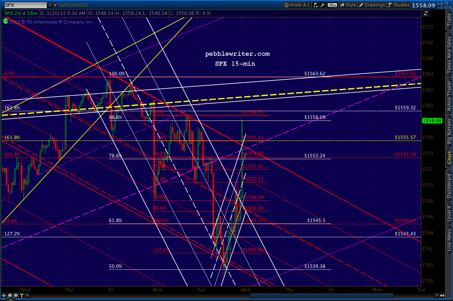
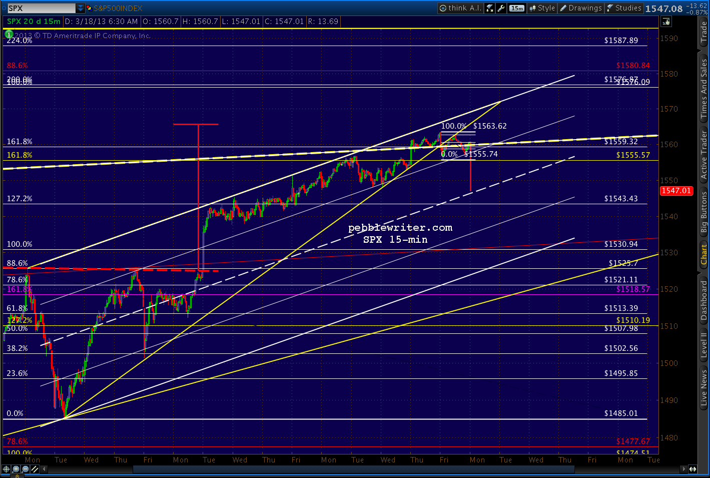
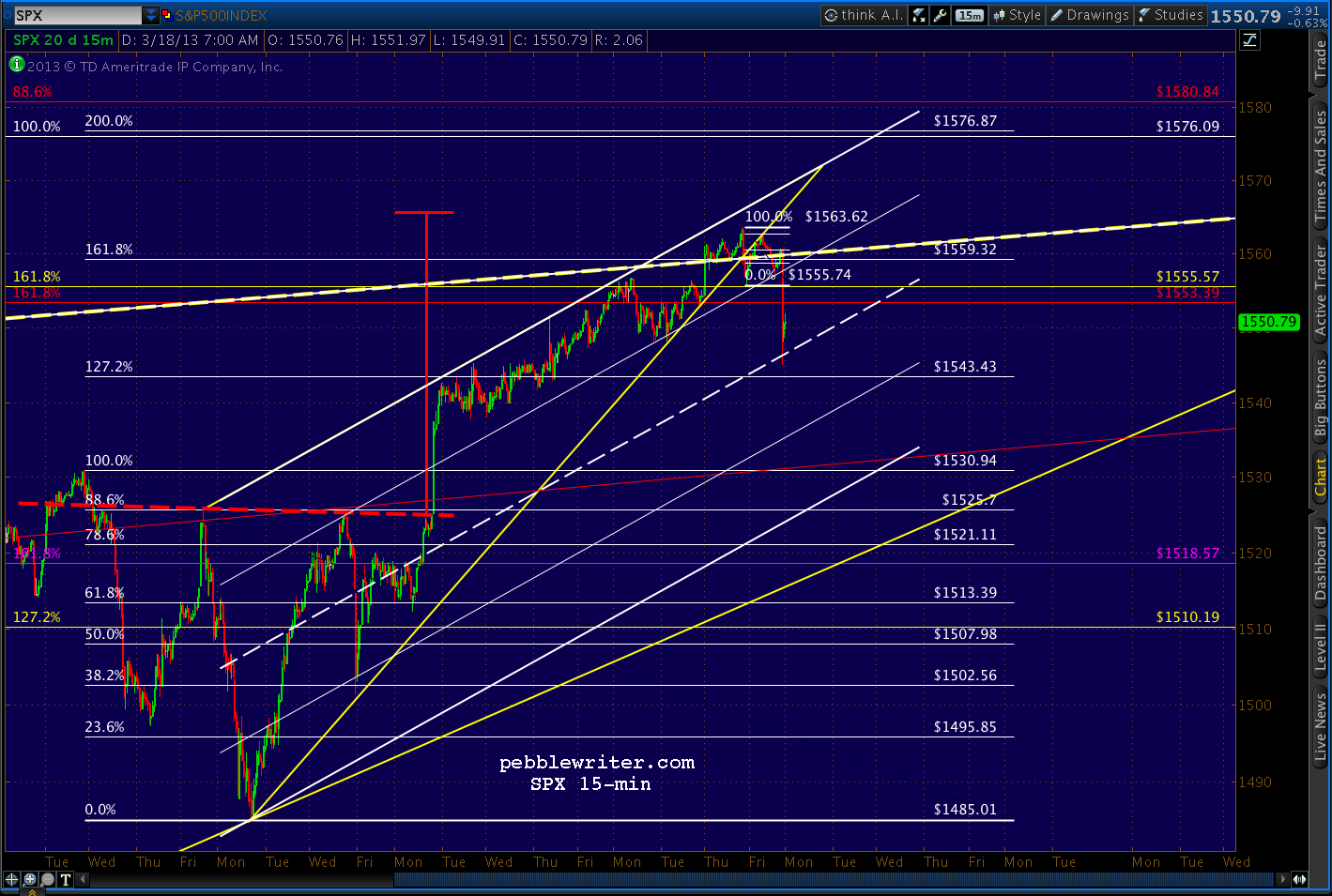
The smallest rising wedge on SPX has clearly broken down and should now try to establish a channel something like the one drawn below. Look for a playable bounce here around the midline between 1543.43 and 1546.


UPDATE:  10:10 AM

We got the expected bounce at 1545.13.  If the bears can keep the trend going, it should fail before the next higher channel line -- currently around 1558 -- or the yellow TL up at 1560.  But, of course, there's no reason it has to be more than 1553.39 (the 1.618 extension of the 1370-1074 correction in 2011) or 1552.19 (the .382 retracement of the move down from 1563.32.)


As legitimate as the little white channel above appears, it's merely a conjecture.  A pitch.  If Cramer & Co. can convince the average small investor to ignore the implications of Cyprus and embrace a market selling near all-time highs, the channel is proof of the absence of risk in the markets.

It coincides nicely with the midline of the larger purple channel that's guided SPX's upside since November.  To bulls, this morning's dip looks like nothing more than a successful test of the midline.


Here's a close-up, showing the tag of the .236 Fib (red) and slight push below the purple midline.  Important for the bullish case: (1)  the white 1.272 is even still intact, and (2) prices are re-testing the 1.618 Fib at 1553.39.

If SPX pushes higher than 1553.39, it reinforces the idea that the Crab Pattern set up by 2011's plunge from 1370 to 1074 is going to fail (8 points would be a failure.)  If it drops below, then the push up to 1563 can be characterized as a momentary blip of irrational exuberance.


The technical elephant in the room, of course, is whether or not SPX will continue to take a run at the previous high of 1576.  It's not as though bulls will throw in the towel over Cyprus.  Take the move down from 1563, for instance.


If this bounce from 1545 retraces all the way to the .786 at 1559.66, it will have set up a potential Butterfly Pattern that targets 1575.   Look for the little white channel to turn by the .500 (1554.38)  in order to construct another leg up.

UPDATE:  1:25 PM

Where does this morning's dump fit in with yesterday's LT charts from the last post [see: Do or Die]?

continued on pebblewriter.com...

Tuesday, March 5, 2013

After the Funding's Gone

~reposted from pebblewriter.com

After a scary drop in equity futures overnight, the market looks to open soft...but not exactly panicked. I remain short since 1525.34 on the 28th, but will continue to play any significant bounces that come our way.

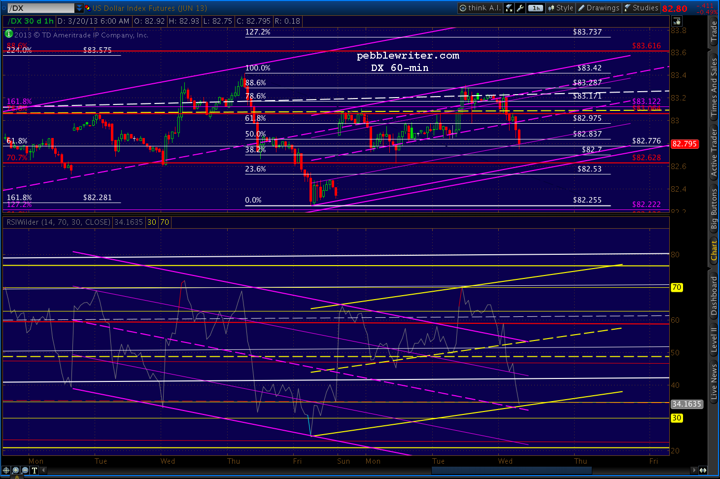
The dollar is still looking strong, reflecting both plenty of fear and euro weakness.  Note, DX reached our intermediate target range from last month (the red .618 @ 82.22 & white 1.618 at 82.28.)


The next level of resistance is the red .786 at 83.064 where it intersects with the purple 1.618 at 83.122.  The acceleration channel that's carried prices skyward since Feb 1 intersects that nexus this week.

Also intersecting there are two channel lines -- the large white midline and the much larger yellow midline -- seen here on the weekly chart.


Daily RSI still shows plenty of upside potential, though we've also seen some negative divergence start to creep into the picture.


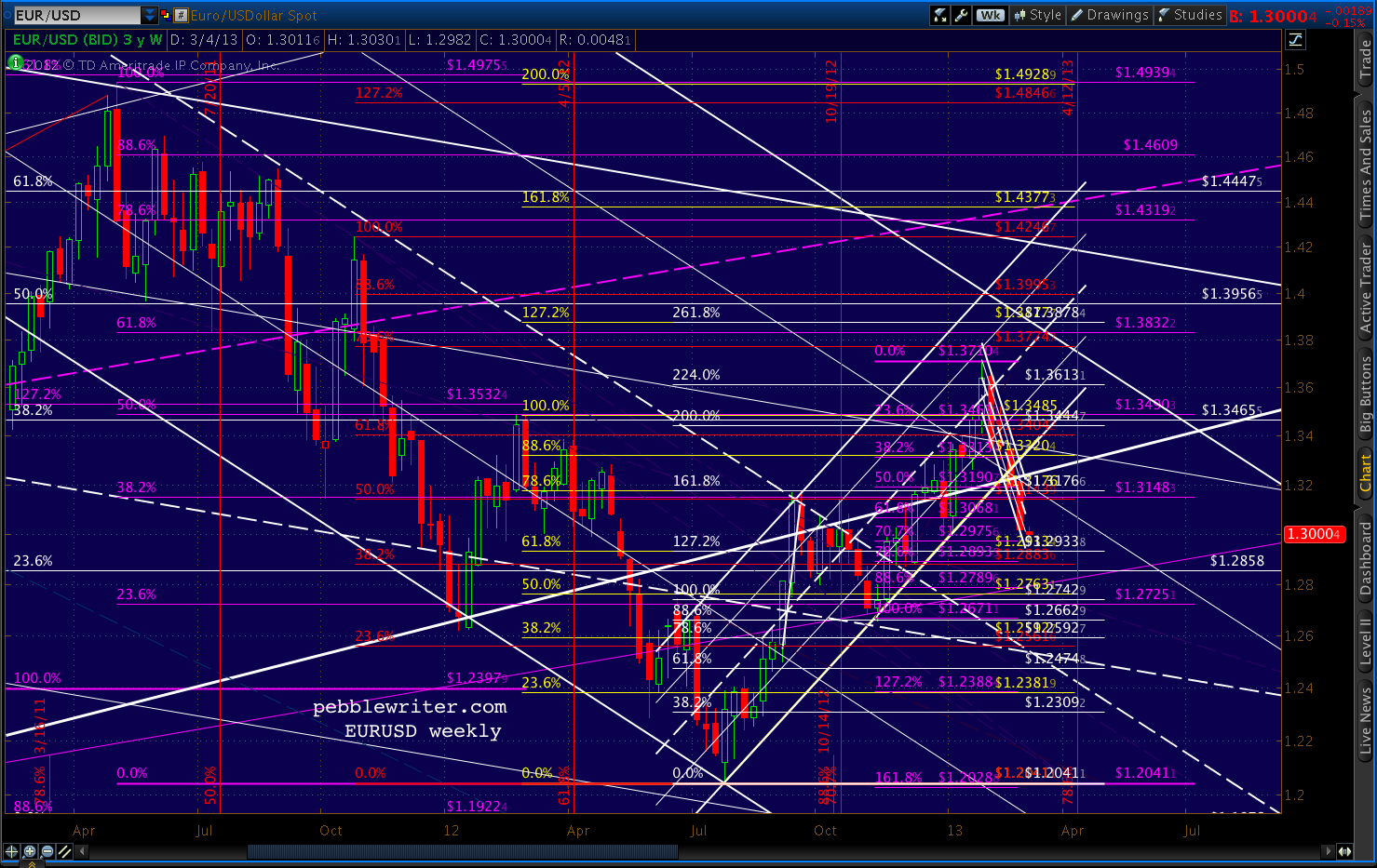
As noted back on Feb 21, the EURUSD has broken down from its rising channel (white) and has accelerated to the downside, breaking the Jan 4 1.2996 low and the psychologically important 1.30 level.


The intersection of the purple .618 and two white channels at 1.38 will have to wait (until my next visit across The Pond, no doubt.)


Losing the rising white channel hurts momentum quite a bit, but it's the drop back through the 75% line on the falling white channel that represents the bigger problem for the pair.

This channel dates all the way back to Dec 06. Reaching the top for the third time is still possible, of course, but it's that much harder now that the pair needs to retake the higher channel line and mount a fresh attack.

I've redrawn the falling white channel as red and will lower its top (for now) to reflect the brick wall it ran into.  I've also sketched in a more relaxed rising channel (light blue) that reflects potential channel support at current prices (the intersection of the falling red .75 and the rising light blue .25.)


I don't know whether the pair needs to retest the falling white midline or not.  The bottom of the new light blue channel intersects with the red .75 in mid-March.  Also there is the .25 of the very large rising purple channel, which provided a huge bounce in Jun 2010.  It's easier to see in the LT chart below.


Recall that we closed a long position and last went short at 1525.34.  From there, SPX fell nearly to our initial target (1496-1500), reaching 1501.48 Friday morning before the bounce to 1519.99.

As we discussed last week, the reversal at the red .786 could be the full extent of a corrective wave on the way lower (the B wave in an A-B-C)  that is meant to test the bottom of the white or purple channels.  But, it could also be the Point B in a Butterfly Pattern targeting 1531 or 1540.


continued on pebblewriter.com... 
 

Monday, February 11, 2013

Is It or Isn't It (a Recession)?

~reposted from pebblewriter.com...

ECRI's Weekly Leading Indicator (WLI) came out Friday at 130.2 -- up from 129.6 the week before.  Further, they reported that the index's annualized growth rate increased from 8.2 the previous week to 8.9% -- the highest since May 2010.  I wondered: are they retracting their Sep 2011 recession forecast?  Are things really getting better?

CAN'T WE ALL JUST GET ALONG?
There's currently an argument raging between various economists and analysts as to whether the US is still in/dipping back into a recession or is on the mend. ECRI is pretty sure we're in one, while folks like Doug Short and, of course, the mainstream media think not.

There's no question that we've seen an uptick in several economic measures. My own thesis is that most of these have been not secular, but cyclical swings.  In other words, I don't yet see evidence of a sustainable trend change, only natural swings from one side of a channel or wedge to the other.

Here's an example I posted last week. Total Confidence has traced out a pretty solid-looking channel, while the Present and Expectations indices have formed expanding wedges (and are nowhere near their upper bounds, especially given the recent downturns.)
 
Hardly a day goes by when I don't second guess myself.  Is all the "good news" just one big, well-coordinated head fake or am I missing something?  I spent much of the weekend studying ECRI's historical WLI (who says technical analysts don't live exciting lives!?) and found a lot to think about.  First, a brief primer on Harmonics.

HARMONICS

Regular readers of pebblewriter.com (heck, even the irregular ones) know all about Harmonics and that the corrections experienced in April 2010, May 2011 and Sep 2012 correspond to the important Fib levels of 61.8%, 78.6% and 88.6%.


For the uninitiated, measure the drop from SPX 1576 (Oct 2007) to 666 (Mar 2009) and multiply it by a Fibonacci 61.8% and you get 1228.74.  SPX reached 1219.80 in April 2010 (within 10 points) and promptly sold off by 17% over the next three months.

In May 2011, SPX peaked about 10 points away from the 78.6% Fib level (completing a Gartley Pattern) and plunged 21.6%.  And, in September 2012, SPX reached the 88.6% Fib level (completing a Bat Pattern) and corrected by almost 9%.

Those of us who follow Harmonics were well aware of each of these downturns well in advance [see: HERE, HERE and HERE] and profited nicely from the market's plunges.  Those who rely solely on fundamentals or [involuntary shudder] the mainstream media...not so much.

THINGS THAT MAKE YOU GO "COOL!"

While I had noticed the WLI's channel-like general decline before, I never noticed that it also complied with the rules of Harmonics.  From its all-time high of 143.73 in Jun 2007, the WLI plunged to a low of 105.40 in Mar 2009.


Like SPX, it found its footing (thanks to QE1) and started higher.  Its first big pause was in Oct 2009 at the 61.8% Fib level.  It paused again in Jan 2010 near the 70.7% Fib, and eventually reached the 78.6% level in April -- completing a Gartley Pattern as SPX had finally retraced 61.8% of its drop.

One could infer from the mismatched Fib levels that the economy -- as measured by ECRI's leading indicators -- was ahead of the market at this point. The WLI had retraced 78.6% of its drop, while SPX had only retraced 61.8%.  In any case, they both suffered from the removal of the QE drip - SPX shedding 17% and WLI 11%.

When the Fed realized their patient would flatline without more QE, they were back with QE2.  The market took off, reaching the 78.6% Fib in May 2011.  This also completed a Crab Pattern, a 161.8% extension of the amount of the Apr-Jul 2010 slide.

The WLI, however, retraced only 78.6% of its slide since its 2010 high.  In other words, the market was now officially ahead of the economy.


Following the expiration of QE2, SPX plunged 21.6% to 1074 through October 2011, while WLI gave up 8.9%.  From there, SPX climbed to 1474 primarily on Fed jawboning and promise of more QE -- which it finally delivered the day before the 1474 high.

The timing was no doubt an effort to send the SPX soaring right through the 88.6% Fib retracement of the 1576 - 666 crash.  I seriously doubt that "two points over" was what they had in mind (the market sold off anyway, correcting a respectable 8.8% to 1343.)


The WLI, in the meantime, topped out at 127.77 -- only an 88.6% retracement of its decline from its previous high in 2011.  Again, the market was outpacing the economy.

IS IT OR ISN'T IT?

The world of market prognosticators is, as always, divided.  There are those who believe the economy is improving, and the market - as a leading indicator itself - is all the proof we need.  Then, there are those who believe the market is priced well in excess of levels justified by the underlying economy -- which remains in or is dipping back into a recession.

Whether QE has "saved" the economy or not, I don't know of any respected economist or technician who doubts that it has significantly goosed (i.e. "manipulated") the markets. And, we should pay attention to the disconnect between the markets and the economy as evidenced by the SPX/WLI comparison.

The WLI just hit an important Fib level (88.6%) after demonstrating that it does, indeed, pay attention to such things.  This occurred at the same time that the S&P 500 hit several important Fib levels and is thus, by my reckoning at least, poised to correct [see: Satisfaction.]

We all know the old truism "the market isn't the economy." However, another quarter of negative GDP following the tax hikes recently enacted and spending cuts in the works would certainly remind investors that the market and economy are, indeed, joined at the hip.

I care about the economy because I have children.  The Fed's unprecedented experiment in QE will quite possibly end very badly for the country, for my children and for yours.  But, there ain't much We the People can do to influence Fed policy.  They don't answer to us or our political "leaders." So, we play the cards we're dealt.

As an investor, my goal is to capitalize on whatever the market throws at us -- regardless of how manipulated it might be, and regardless of what economists call the current business cycle. If depression or hyper-inflation come along, we'll hopefully see it coming and be well-positioned.

Are we still in or dipping back into a recession? Will the current QE4-ever result in another 2009-2011 run, or does the market's yawn last September signal the end of QE's effectiveness?  We'll find out in time.  In the meantime, we have some very good tools at our disposal that have provided excellent returns in a very difficult market.  I'll continue to call it as I see it, and appreciate having you all along for the journey.

*  *  *  *  *  *  *  *

Interested in learning more about Harmonics and Chart Patterns?  Want to learn how to apply their predictive powers to your investing?  Check out pebblewriter.com, a leading independent website dedicated to educating its members about market analysis and forecasting.  For membership information, click HERE.

Friday, December 28, 2012

Winding Down

Today's post concludes a week of publicly available intra-day posts, my little gift to those considering a pebblewriter membership.

Seems like everyone's talking about the fiscal cliff.  I'd like to take a moment and talk about another important issue: the Fee-scal Cliff.

As announced on Monday, subscription prices will increase on January 1.  In keeping with our practice of paying for performance, the annual rate will be about $10 for each percentage point of return since the new site’s inception on Mar 22, 2012.


We’re up about 95% over those first nine months [SEE DETAILS HERE] so the new rates will be as follows:
  • Annual:  $950
  • Semi-Annual: $550
  • Quarterly:  $375
The first fifteen to sign up for an annual membership at the current rate of $800, however, will be granted Charter Member status.  Charter Member rates are locked in for the life of the site, so you’ll never pay more — no matter where annual rates end up.

If we are fortunate enough to continue averaging a little over 10% per month, annual memberships would be $1,200+ in March.  So, locking in current prices is a no-brainer.

Sign up HERE.

*  *  *  *  *  *  *  * 

Time is running out for the Heroes of The Hill.  Market corrections don't require that everyone turn bearish -- just the handful in the middle whose selling turns the tide.   Those investors who have been wondering, waiting hopefully for a fiscal cliff deal to emerge from Washington... might at least a few of them decide to rein in their equity exposure today?

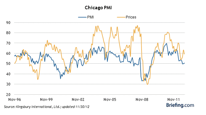
Watch this morning for the Chicago PMI -- due out at 9:45 EST.  Last month, it turned up slightly, but was considered bearish due to the decline in new orders.  From Briefing.com:


Briefing.com puts out great graphs, such as this one on the relationship between pricing and the PMI itself.  Not a terribly bullish looking chart.
 
UPDATE:  9:44 AM

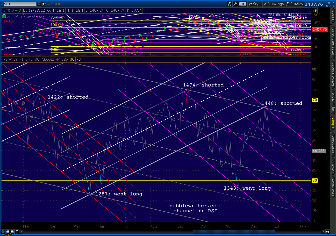
We remain short from 1447 on Dec 18.  RSI has a long ways to go before finding any channel support...


Why am I always talking about RSI? It might be the fact that it's helped me call almost every major turn the past couple of years.  As regular readers know, I employ a deceptively simple-looking practice of channeling RSI values in different time frames.

Combined with Harmonics and other chart patterns, it has been very effective in forecasting.  Consider the past six months alone...


April 2 -- Shorted:  SPX completed a Butterfly Pattern at a channel top at 1421.05.  It was also the third lower RSI value in a row on higher prices (negative divergence) after RSI tagged a channel midline.  See: All the Pretty Butterflies.

June 1 -- Went Long:  SPX reached the bottom of an RSI channel, back-tested a falling wedge and found harmonic support -- all at the price levels forecast by an analog that had been going gangbusters since April 9.  See: Why I'm Buying.

September 14 -- Shorted:  SPX had completed a Bat Pattern that dated back to October 2007, tagged RSI and price channel lines.  VIX and DX RSI channels also indicated impending reversals. See: The World According to Ben.

November 16 -- Went Long:  SPX had reached three important harmonic targets, reached a H&S Pattern target, tagged RSI and price channel bottoms -- all at a price level forecast on October 31.  See: CIW Nov 16.

December 18 -- Shorted:  Prices overshot our forecast target by 6 days and 10 points, completing a Gartley Pattern set up by the 1474 - 1343 drop. But, in the process, daily RSI completed a perfect back-test of the recently broken channel that had governed the rally since June.  See: CIW Dec 18.

Together, these major moves accounted for returns of about 40% since the new site's inception on March 22.  The other 55% came from interim swings ranging from an hour to a few weeks [see: Results.]  But, all of them were influenced by RSI channels.

I don't know of any analysts who use them.  A Google search for the term "RSI channel" shows a whopping 3 hits in the past month -- two of them from this site.  Have folks tried them and failed, or are they just too complicated?

Though they're almost always obvious in the rear-view mirror, RSI channels can be very difficult to use in forecasting.  Charts drawn in different time frames can suggest very different results.  They're tough to use in choppy, directionless markets.  And, divergence is always a challenge.

In short, RSI channels aren't for everybody.  It helps if you enjoy staring at charts for hours at a time, and can pick out patterns in a jumble of seemingly random lines.  It also helps to understand higher math, as RSI is essentially a derivative of price movements (magnitude and velocity of price changes.)

If you're thinking about using RSI channels, you might want to start with an aptitude test -- available here.  Or, just tune in each day and I'll let you know what I think.  After a year of practice and a few thousand charts, I view them as an indispensable secret weapon.

UPDATE:  12:20 PM

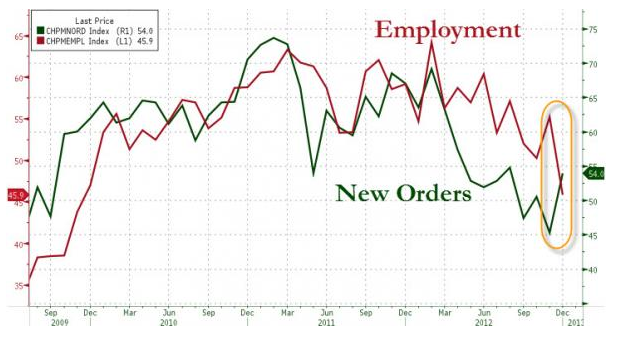
Chicago PMI [download here] actually increased from 50.4 to 51.6 this month -- though it would still have been below 50 if not for the always handy "seasonal adjustment."

The increase again conceals a troubling development: employment and capital spending are both sliding.  New orders rebounded almost to October levels, but CapEx hit a new 28-month low, while employment plunged from 55.2 to 45.9 -- the lowest level in three years.


continued on pebblewriter.com...