PEBBLEWRITER.COM IS LIVE!


*************** PEBBLEWRITER.COM IS LIVE! TO SIGN UP, CLICK HERE ***************


Showing posts with label investing. Show all posts

Wednesday, June 26, 2013

Update on Gold: Jun 26, 2013

reposted from pebblewriter.com~

It's been over a month since I last focused on gold.  The equities markets have kept me working overtime, and I assumed our May 15 forecast had long since jumped the tracks.

At the time, gold had plunged 270 to 1321 per ounce in only 4 sessions, bounced at 1321 (the day after our bottom call) to within 13 of our upside target, and was returning for a second bounce -- or not.   From that post [Update on Gold: May 15, 2013]:
Now, at 1373, it has reached a critical juncture that should result in either a sharp rally to 1560 or a plunge to 1141 in the coming month or so.
GC was closing in on the .786 retracement of the the rise off the 1321 bottom.  Playing the bounce was a low risk trade as long as one used trailing stops.
Long positions could be played from the .786 (1357) or .886 (1340) as long as stops are watched very carefully and updated frequently.
 The downside case is probably stronger.  If the current plunge continues past 1321, there are only a few key levels of support before things get really nasty:
  • horizontal support at 1302-1309
  • potential Fib targets of 1276 (the 1.272) or 1219 (1.618)
  • Fib support at 1141-1157
  • Fib support at 947
The bounce came a few days later at the .886 (1336) and despite gaining 84, couldn't clear the big white channel midline, much less the smaller red channel (white in previous charts) it had been in since last September.

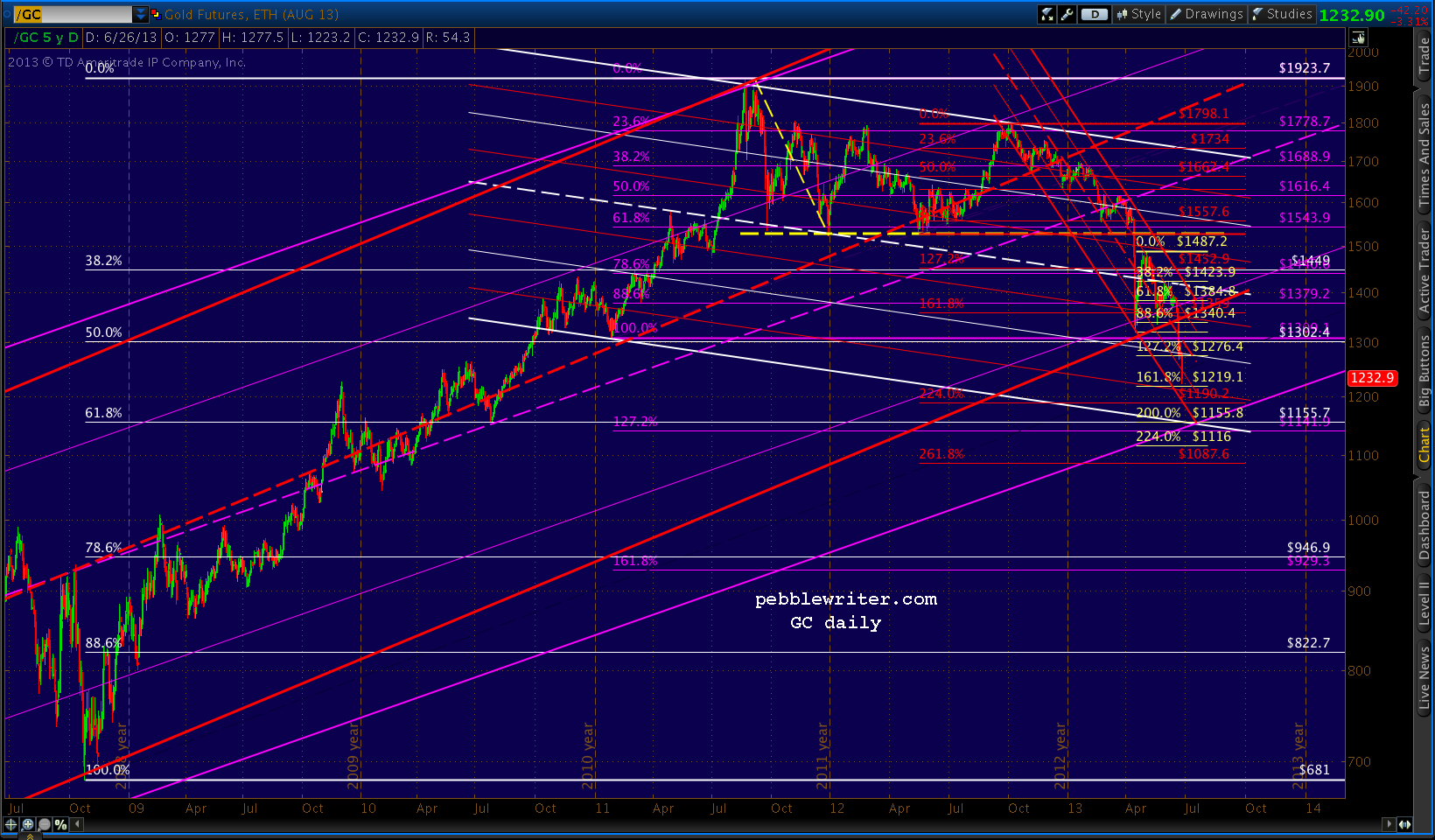
When the big red channel from 1999 broke down on Jun 20, GC plunged again.  It failed to catch a bid at the first support level, but is approaching the second one this morning: the yellow 1.618 that completes the Crab Pattern at 1219.10.


This seems like an opportune time to update the forecast, as gold's price action continues to provide valuable clues as to investors' expectations about QE, the value of the dollar and inflation.  Are the many calls for gold to fall below $1000 per ounce well-founded?

Probably not.  We should get a decent bounce beginning at or near 1219 today that could take prices as high as 1320 or so by July 5-8.  A continued rally through the red midline would mean additional gains to 1357-1385 by mid-July.

But, there's a better chance of a plunge to 1155 instead -- and it need not respect the Crab Pattern about to complete, especially if today's equity rally falters (gold certainly isn't buying the More QE! snake oil.)

Remember that 1155 is the .618 retracement (in white below) of the huge rally from 681 in 2008 to last September's 1923 all-time high. Around July 15, the bottom of the big white channel and the bottom of the red channel intersect there with the bottom of the big purple channel (it replaced the red one that failed on Jun 20.)

This is the same price target we identified in our April 15 Update on Gold.

We can speculate about what circumstances might provide for a floor.  The prevailing wisdom these days is yet another round of QE -- or at least inflation of some variety. With interest rates on the rise, that seems likely enough.  We'll stick a pin in the idea of a mid-July market calamity that necessitates Fed intervention.

...continued on pebblewriter.com...

Thursday, April 25, 2013

The Best Laid Plans

The best laid plans of mice and men
Go often awry,
And leave us nothing but grief and pain,
For promised joy!
Robert Burns, 1785


ORIGINAL POST:  6:45 AM EDT

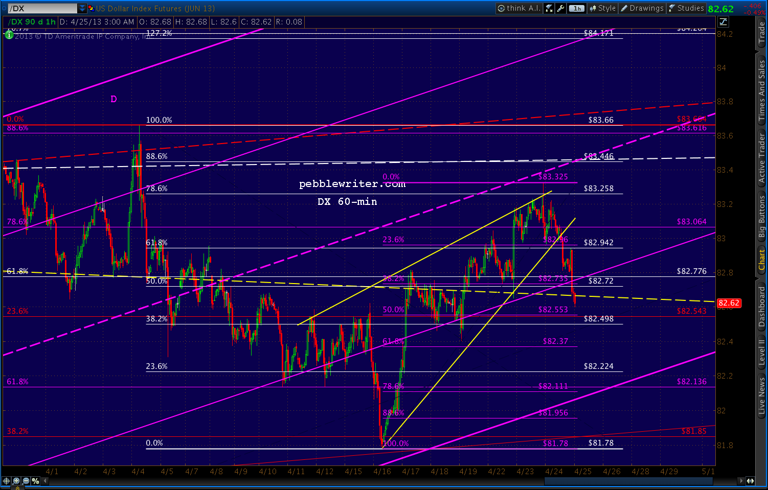
The wedges we've been watching on DX and EURUSD are playing out.  EURUSD has broken out...


...and DX has broken down.


But, it's the USDJPY that I'm watching especially closely this morning.  It still hasn't broken 100 since our Apr 8 observation [USDJPY update] that it was running out of steam:
"...there is growing risk of a downturn as it approaches 100... it appears the pair might have hit at least interim resistance at today’s high."
It topped out 3 sessions later at 99.94, and two weeks later is in danger of a larger pullback.


Remember, weakening the yen was a critical element of the BOJ's stimulus program that was supposed to generate inflation, boost Toyota sales and send Japanese investment funds flooding into foreign markets.


Instead, Japanese investors are repatriating their funds from abroad -- a net Y9.5 trillion ($95 billion) since the first of the year.  Why?  As any US investor could tell you, QE might not inflate economies, but it sure as hell inflates markets.

The Nikkei 225 is up 65% since last October's lows....


...and, still hasn't even recovered 2/3 of its losses from the 2007 crash.  The Dow and the S&P 500, by contrast, have recovered all of them -- and, then some.  So, to many, the Nikkei still seems the better value.  It's hard to argue with success.

But, I'll do it anyway.  In reaching 14,020 a few hours ago, NKD tagged the .618 Fibonacci retracement of its 2007-2009 crash from 18,365 to 6990.


To those not familiar with harmonics, this tends to be a big deal.  When SPX reached the equivalent point in April 2010, it plunged 17%.  The DJIA fell almost 15%.  The USD, represented by DX, soared 9.3%.

But, the yen positively soared.  USDJPY started a 17-month slide that took the pair down 20% from 94.98 to 75.78.  NKD, which had just reached its .382 Fib, shed 23% over the next 4 months, eventually reaching almost 30% in Nov 2011.

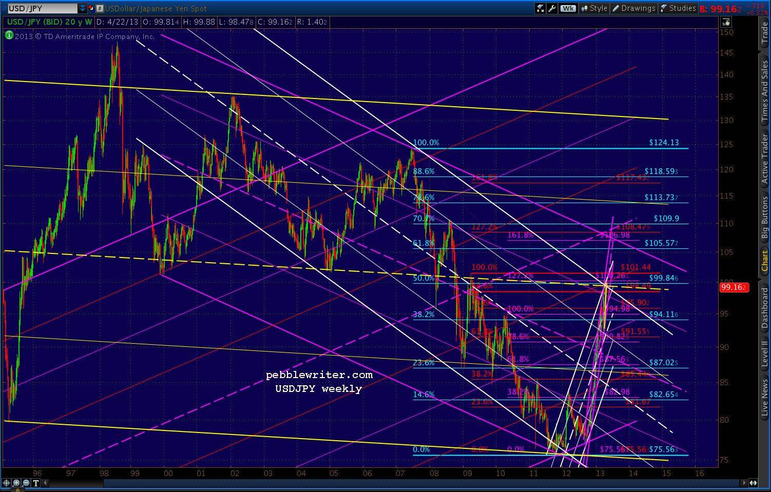
Could the USDJPY's failure to break 100 be telling us something?  You better believe it.  I called a top a few weeks ago because the pair had reached several important Fib levels as well as the midline of an important channel (in yellow, below)...


...that dates back to 1995.


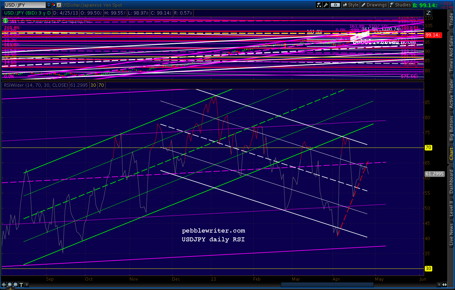
There's no guarantee it won't push through instead of retreating, but the RSI picture supports the danger of a significant retreat.

Daily RSI has backtested the broken yellow channel twice, but the trend is clearly down -- with the latest push being rebuffed by the purple midline.


And, a close-up reveals that a breakdown has already started.


Monday, February 11, 2013

Is It or Isn't It (a Recession)?

~reposted from pebblewriter.com...

ECRI's Weekly Leading Indicator (WLI) came out Friday at 130.2 -- up from 129.6 the week before.  Further, they reported that the index's annualized growth rate increased from 8.2 the previous week to 8.9% -- the highest since May 2010.  I wondered: are they retracting their Sep 2011 recession forecast?  Are things really getting better?

CAN'T WE ALL JUST GET ALONG?
There's currently an argument raging between various economists and analysts as to whether the US is still in/dipping back into a recession or is on the mend. ECRI is pretty sure we're in one, while folks like Doug Short and, of course, the mainstream media think not.

There's no question that we've seen an uptick in several economic measures. My own thesis is that most of these have been not secular, but cyclical swings.  In other words, I don't yet see evidence of a sustainable trend change, only natural swings from one side of a channel or wedge to the other.

Here's an example I posted last week. Total Confidence has traced out a pretty solid-looking channel, while the Present and Expectations indices have formed expanding wedges (and are nowhere near their upper bounds, especially given the recent downturns.)
 
Hardly a day goes by when I don't second guess myself.  Is all the "good news" just one big, well-coordinated head fake or am I missing something?  I spent much of the weekend studying ECRI's historical WLI (who says technical analysts don't live exciting lives!?) and found a lot to think about.  First, a brief primer on Harmonics.

HARMONICS

Regular readers of pebblewriter.com (heck, even the irregular ones) know all about Harmonics and that the corrections experienced in April 2010, May 2011 and Sep 2012 correspond to the important Fib levels of 61.8%, 78.6% and 88.6%.


For the uninitiated, measure the drop from SPX 1576 (Oct 2007) to 666 (Mar 2009) and multiply it by a Fibonacci 61.8% and you get 1228.74.  SPX reached 1219.80 in April 2010 (within 10 points) and promptly sold off by 17% over the next three months.

In May 2011, SPX peaked about 10 points away from the 78.6% Fib level (completing a Gartley Pattern) and plunged 21.6%.  And, in September 2012, SPX reached the 88.6% Fib level (completing a Bat Pattern) and corrected by almost 9%.

Those of us who follow Harmonics were well aware of each of these downturns well in advance [see: HERE, HERE and HERE] and profited nicely from the market's plunges.  Those who rely solely on fundamentals or [involuntary shudder] the mainstream media...not so much.

THINGS THAT MAKE YOU GO "COOL!"

While I had noticed the WLI's channel-like general decline before, I never noticed that it also complied with the rules of Harmonics.  From its all-time high of 143.73 in Jun 2007, the WLI plunged to a low of 105.40 in Mar 2009.


Like SPX, it found its footing (thanks to QE1) and started higher.  Its first big pause was in Oct 2009 at the 61.8% Fib level.  It paused again in Jan 2010 near the 70.7% Fib, and eventually reached the 78.6% level in April -- completing a Gartley Pattern as SPX had finally retraced 61.8% of its drop.

One could infer from the mismatched Fib levels that the economy -- as measured by ECRI's leading indicators -- was ahead of the market at this point. The WLI had retraced 78.6% of its drop, while SPX had only retraced 61.8%.  In any case, they both suffered from the removal of the QE drip - SPX shedding 17% and WLI 11%.

When the Fed realized their patient would flatline without more QE, they were back with QE2.  The market took off, reaching the 78.6% Fib in May 2011.  This also completed a Crab Pattern, a 161.8% extension of the amount of the Apr-Jul 2010 slide.

The WLI, however, retraced only 78.6% of its slide since its 2010 high.  In other words, the market was now officially ahead of the economy.


Following the expiration of QE2, SPX plunged 21.6% to 1074 through October 2011, while WLI gave up 8.9%.  From there, SPX climbed to 1474 primarily on Fed jawboning and promise of more QE -- which it finally delivered the day before the 1474 high.

The timing was no doubt an effort to send the SPX soaring right through the 88.6% Fib retracement of the 1576 - 666 crash.  I seriously doubt that "two points over" was what they had in mind (the market sold off anyway, correcting a respectable 8.8% to 1343.)


The WLI, in the meantime, topped out at 127.77 -- only an 88.6% retracement of its decline from its previous high in 2011.  Again, the market was outpacing the economy.

IS IT OR ISN'T IT?

The world of market prognosticators is, as always, divided.  There are those who believe the economy is improving, and the market - as a leading indicator itself - is all the proof we need.  Then, there are those who believe the market is priced well in excess of levels justified by the underlying economy -- which remains in or is dipping back into a recession.

Whether QE has "saved" the economy or not, I don't know of any respected economist or technician who doubts that it has significantly goosed (i.e. "manipulated") the markets. And, we should pay attention to the disconnect between the markets and the economy as evidenced by the SPX/WLI comparison.

The WLI just hit an important Fib level (88.6%) after demonstrating that it does, indeed, pay attention to such things.  This occurred at the same time that the S&P 500 hit several important Fib levels and is thus, by my reckoning at least, poised to correct [see: Satisfaction.]

We all know the old truism "the market isn't the economy." However, another quarter of negative GDP following the tax hikes recently enacted and spending cuts in the works would certainly remind investors that the market and economy are, indeed, joined at the hip.

I care about the economy because I have children.  The Fed's unprecedented experiment in QE will quite possibly end very badly for the country, for my children and for yours.  But, there ain't much We the People can do to influence Fed policy.  They don't answer to us or our political "leaders." So, we play the cards we're dealt.

As an investor, my goal is to capitalize on whatever the market throws at us -- regardless of how manipulated it might be, and regardless of what economists call the current business cycle. If depression or hyper-inflation come along, we'll hopefully see it coming and be well-positioned.

Are we still in or dipping back into a recession? Will the current QE4-ever result in another 2009-2011 run, or does the market's yawn last September signal the end of QE's effectiveness?  We'll find out in time.  In the meantime, we have some very good tools at our disposal that have provided excellent returns in a very difficult market.  I'll continue to call it as I see it, and appreciate having you all along for the journey.

*  *  *  *  *  *  *  *

Interested in learning more about Harmonics and Chart Patterns?  Want to learn how to apply their predictive powers to your investing?  Check out pebblewriter.com, a leading independent website dedicated to educating its members about market analysis and forecasting.  For membership information, click HERE.

Friday, January 25, 2013

The Dow: Time to Double Down?

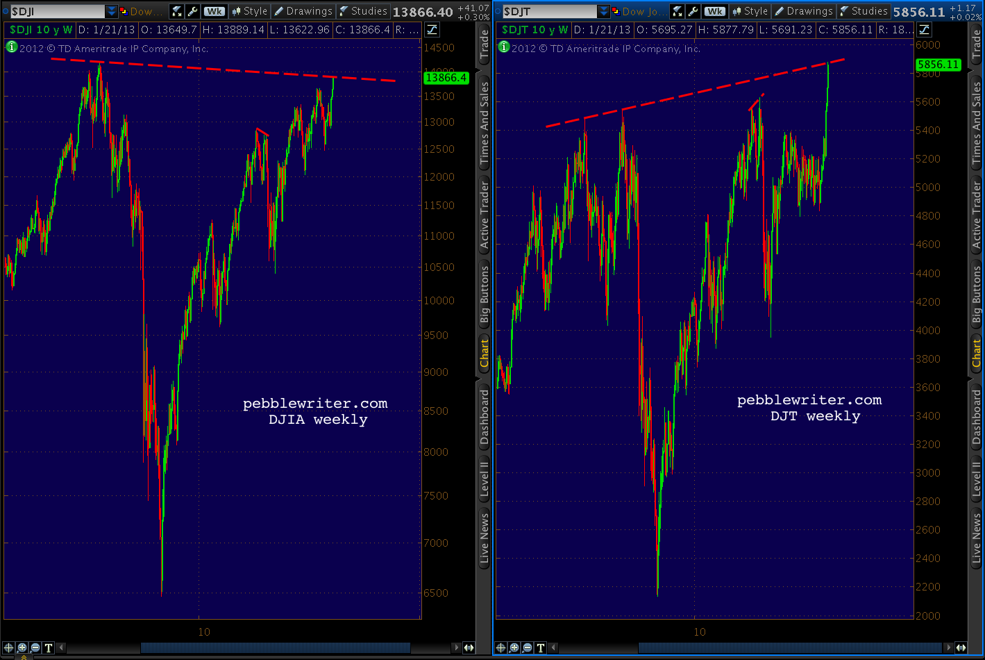
Many are watching the Dow Transports' recent all-time highs, wondering if Dow Theory suggests new highs for the DJIA as well.

Without wading into the debate over which interpretation of the theory holds water and which are all wet, I think it's important to recognize that the DJIA is one of those indices not making new all-time highs lately.

Should the Industrials not break above 14,198.10, this would be considered a Dow Theory non-confirmation, at least on a larger scale.  The last time this happened was in July of 2011, when the Transports made a new high of 5627.85 and the DJIA failed to best its May 2 12,876 high.

We can argue about cause and effect, but there's no argument about what happened next.


Eighteen months later, the DJT has again broken out to new all-time highs.  DJIA has not.  Here's the current visual, which shows the current degree of divergence is much larger than back then.


The Industrials, in fact, are a great candidate for a double-top.


Drilling down, we can see DJIA has nearly completed a Crab Pattern at the Fibonacci 161.8% extension (14,201.84) of the July-October 2011 crash (the white pattern.)


It intersects nearly perfectly with the previous 2007 high of 14,198.10 at the very point where the purple channel top and white 25% channel line also intersect.  But, it need not even reach that level to be considered a double top (within 1%.)

And, only a few points away we find a Butterfly Pattern target (small red pattern) at 13,985.65 and a Crab Pattern target (in white) of 13,963.50.


The last leg up in the move since October 2011 has been 1424 points -- roughly 87% of the leg 3 rally between June and September of 2012.  A Fibonacci 88.6% of the leg 3 rally would register at 13,912 -- well within the margin of error for any of the harmonic patterns mentioned above, and only 16 points above today's high.


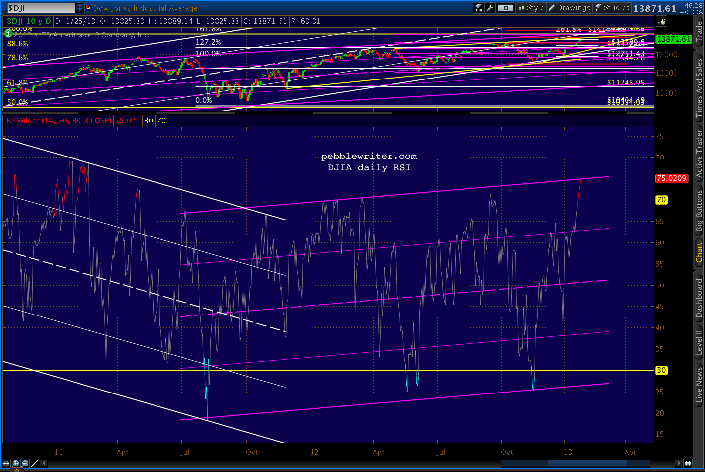
And, for those who, like me, love to channel stuff, the DJIA's daily RSI has its own bearish tale to tell.


Could DJIA blow through 14,200 confirm the Transports' all-time high and spoil the bears' party?  Of course.  There are still plenty of earnings reports to sift through, including AMZN, CAT, FB, YHOO, IP, PFE and F in the next few days.  We could get great Durable Goods numbers Monday, Case-Shiller Home Price Index on Tuesday, or a bullish FOMC outcome on Wednesday.

But, anyone counting on new all-time highs should remember July 2011 and consider protecting their downside.

Tuesday, January 15, 2013

AAPL: Flirting with Disaster

Not since the summer of 1666, as young Zack Newton sat pondering gravity, has so much attention been paid to a falling apple.

Should we care about AAPL's deteriorating powers of levitation?  The $200/share drop since its September highs, especially on the heels of a new dividend and share buyback program, has been unnerving.  But, if you invest based on fundamentals, it's a solid company selling at 11 times earnings and a 62% 5-year CAGR -- which happens to be on sale.

If you pay attention to chart patterns, however, AAPL is flirting with disaster.  It's a mere point or two from completing a Head & Shoulders pattern that targets the low 300's. [To read about how H&S patterns work, click HERE.]


Even if you don't give a darn about chart patterns, know that many other investors do.  The four tags of the white trend line (the neckline) in the past month are ample proof.  So are the many previously completed patterns that weighed on AAPL.

In January 2008, AAPL completed a H&S pattern that saw share prices drop from 200 to 115 in a few short weeks.


Buyers at 115 were rewarded with a rebound to 190, then punished by a plunge to 78 as the rebound completed a right shoulder in a much larger H&S pattern.


Not every pattern plays out, of course.  Consider the pattern below from 1993-1994 -- a well-formed pattern that targeted much lower prices.


Instead of a big drop off, AAPL found channel support before much damage was done.  Prices rebounded to new highs where they formed a new pattern (in white) which did play out.


Like any other chart pattern, H&S patterns don't occur in a vacuum.  Channels and harmonics often influence the ultimate outcome.

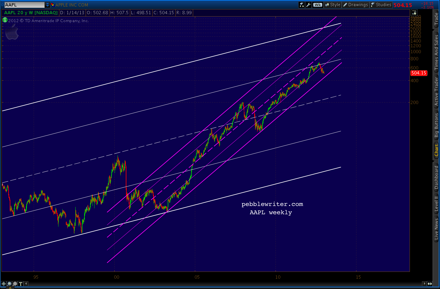
The channel that saved the day in 1995 is still with us, though it most recently offered resistance to higher prices instead of a floor.  It's the white channel in the chart below.

The much smaller, steeply rising purple channel, on the other hand, has kept prices rising -- putting AAPL back on track after two significant sell-offs.  It's currently around 445 -- within a few points of the Crab Pattern 1.618 extension of the failed mid-November rally.


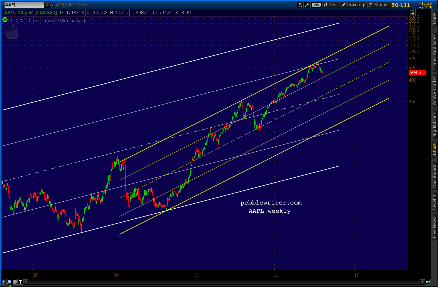
If the current H&S pattern plays out and AAPL drops below the purple channel support, there's another, less bullish channel that could come into play -- seen in yellow below.


The next lower channel line is in the vicinity of the purple line referenced above: 430 or so.  But, if gravity takes hold, mid-line support doesn't show up until around 300.  Ouch.


There are a dozen or more other patterns that could easily influence AAPL's future. There are also many fundamental events that could strengthen the price.

The company's current share buyback scheme, for instance, is only $10 billion -- about the average daily volume at $500/share.  But, with $120 billion in cash on the books and virtually no debt, the company could easily expand it to a more meaningful level.

If this most widely held stock were to crash, could the rest of the market be far behind?  I think there's little question it would. Such an outcome would spell disaster for the bullish story line that TPTB have been working so diligently to construct.

Might they join company insiders in supporting the stock here at 500?  It would be a lot cheaper than another round of QE and, in the end, probably more effective.

Stay tuned.

*  *  *  *  *  *  *  *

reprinted from pebblewriter.com

Saturday, October 27, 2012

Forcasting Made Simple(r)

reposted from pebblewriter.com...

For those not incorporating harmonics into their trading strategy, I can only imagine how utterly confusing the market's last drop must have been.  In fact, the entire past six weeks have been a market maker’s dream — constant whipsawing that would have been impossible to anticipate based on earnings, economic data or the advice of the financial media's talking heads.

Seen through the prism of harmonics patterns, the reversal at 1474 was simply a Bat Pattern completion that paid off the 1576 – 666 drop between 2007 and 2009 [see: The World According to Ben].  And, every reversal since then has followed the rules of ordinary harmonic patterns — with an occasional assist from chart patterns (mostly channels.) 


As can be seen from the chart below, the initial drop from 1474 to 1430 was a Bat Pattern retracement and channel line tag.  It, in turn, set up a Bat Pattern (in purple) that signaled a reversal at 1469.50 (came at 1470.96) and established a declining channel (in white.)


The next move down was to the bottom of the new channel and a .618 retracement of the 1396-1474 rally.  It was followed by another Bat Pattern (in green) targeting a reversal at 1465.78 (came at 1464.02.)

The final move down was initially to the white channel bottom, but pushed through to complete a Bat Pattern .886 retracement of the 1396 to 1474 move, as well as a Crab Pattern (1.618 extension) of the 1430 to 1470 move.

By reaching 1405.45, it also solidified the upside case originally discussed back on the 17th [see: Charts I'm Watching - Oct 17, 2012.]
If 1474 was a normal wave 3 or wave 5 high, we would typically be open to a corrective wave of greater than a .618 retracement.  Look what happens if we make it a .786 or .886 retracement.  Suddenly, the yellow 1.618 lines up very nicely with the other 1.618′s up there at 1515-1518.
In other words, a Crab Pattern with 1405 as its base instead of 1425 (the previous low) is consistent with the 1515 Crab Pattern target established by the 1347-1074 drop from July to October 2011, and the 1518 Crab Pattern target set up by the 1422-1266 drop from April to June 2012.


In hindsight, the harmonics and chart patterns have done an outstanding job of showing us the way — even though there were times when the direction suggested made no sense at all.  I'm almost certain that any unsuccessful trades I’ve made in the past six weeks were the result of “knowing better” than the charts and ignoring their signals.

The question now is whether reaching our 1405 target really suggests a move to 1500+, or is it merely setting the stage for a massive bull trap?

For help, I’m turning to an analog I think looks very promising.  We have done very well with these in the past [see: Why Analogs Work.]  The 2011 as 2007/8 analog knocked the cover off the ball last summer.  And, the latest took us from 1422 down to 1266 and back to 1474 in spectacular style — earning us 60%+ returns over those six months.


This new analog is important not just for its capacity to protect investors from losses, but its potential for nice gains for those who don’t mind speculating a bit.

continued at pebblewriter.com...