PEBBLEWRITER.COM IS LIVE!


*************** PEBBLEWRITER.COM IS LIVE! TO SIGN UP, CLICK HERE ***************


Tuesday, January 29, 2013

DJIA: Any Time Now

Last week, with the DJIA at 13,866, we took a look at the potential for a double-top and a Dow Theory non-confirmation with the Transports [see: The Dow - Time to Double Down.]

Critical levels included the rising wedge upper bound, not to mention a whole slew of approaching Harmonic targets.


Don't look now, but DJIA is only a few points away from tagging the upper bound of the rising wedge, the 2.24 of a Crab Pattern (in white below), and the 1.272 of a Butterfly Pattern (red.)

The double-top up at 14,198 and some larger Harmonic patterns (14,145-14,201) are still a possibility, but this balloon looks ready to pop.


Pebblewriter.com combines Harmonic Patterns with traditional chart patterns and technical analysis.  For more on our process and results, visit pebblewriter.com.


Friday, January 25, 2013

The Dow: Time to Double Down?

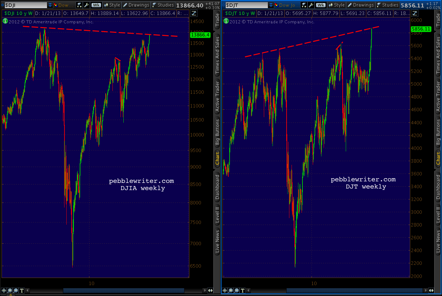
Many are watching the Dow Transports' recent all-time highs, wondering if Dow Theory suggests new highs for the DJIA as well.

Without wading into the debate over which interpretation of the theory holds water and which are all wet, I think it's important to recognize that the DJIA is one of those indices not making new all-time highs lately.

Should the Industrials not break above 14,198.10, this would be considered a Dow Theory non-confirmation, at least on a larger scale.  The last time this happened was in July of 2011, when the Transports made a new high of 5627.85 and the DJIA failed to best its May 2 12,876 high.

We can argue about cause and effect, but there's no argument about what happened next.


Eighteen months later, the DJT has again broken out to new all-time highs.  DJIA has not.  Here's the current visual, which shows the current degree of divergence is much larger than back then.


The Industrials, in fact, are a great candidate for a double-top.


Drilling down, we can see DJIA has nearly completed a Crab Pattern at the Fibonacci 161.8% extension (14,201.84) of the July-October 2011 crash (the white pattern.)


It intersects nearly perfectly with the previous 2007 high of 14,198.10 at the very point where the purple channel top and white 25% channel line also intersect.  But, it need not even reach that level to be considered a double top (within 1%.)

And, only a few points away we find a Butterfly Pattern target (small red pattern) at 13,985.65 and a Crab Pattern target (in white) of 13,963.50.


The last leg up in the move since October 2011 has been 1424 points -- roughly 87% of the leg 3 rally between June and September of 2012.  A Fibonacci 88.6% of the leg 3 rally would register at 13,912 -- well within the margin of error for any of the harmonic patterns mentioned above, and only 16 points above today's high.


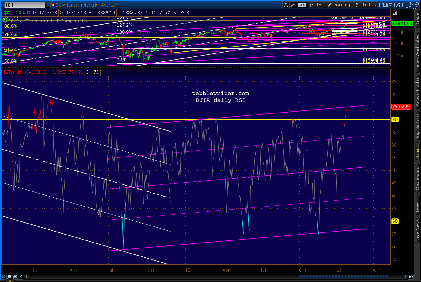
And, for those who, like me, love to channel stuff, the DJIA's daily RSI has its own bearish tale to tell.


Could DJIA blow through 14,200 confirm the Transports' all-time high and spoil the bears' party?  Of course.  There are still plenty of earnings reports to sift through, including AMZN, CAT, FB, YHOO, IP, PFE and F in the next few days.  We could get great Durable Goods numbers Monday, Case-Shiller Home Price Index on Tuesday, or a bullish FOMC outcome on Wednesday.

But, anyone counting on new all-time highs should remember July 2011 and consider protecting their downside.

Thursday, January 24, 2013

Bonds: The Big Picture

~reposted from pebblewriter.com

First, an important caveat:  I'm not a bond guy.  Never have been, never will be -- at least with long bonds under 8%. To me, the idea of sinking even one dollar into a security (which should be downgraded, mind you) that guarantees less than 2% for 10 years borders on insanity.

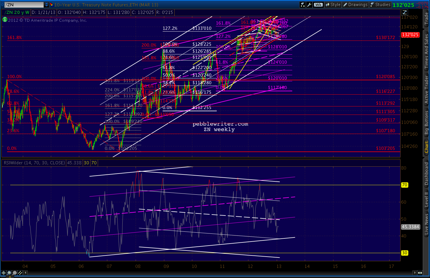
But, different strokes and all that.  Plus, bonds can be a good window on equities and currencies, so I don't mind charting them once in a while.  The 10-yr has obviously been on a tear for several years.  It's settled back from the 2008-09 spike into the bottom half of a channel that dates back to 2005 (white.)


The big question is whether the white channel is still in charge, or the less aggressively sloped purple one has taken over.  Making things interesting, there's a pretty well-formed rising wedge that broke down in August.

But, the RW is slightly suspect because the July 25 high was slightly exceeded on Nov 16 and Dec 6, meaning there are two higher highs and a higher low in place since the August break (though both highs came on negative divergence relative to the July high.)

Harmonics have performed pretty well with the 10-yr note.  The chart below shows a big Crab (grey), followed by another Crab (red), a Bat (white) and another Crab (purple.)  Each previous Crab Pattern completion has been followed by a significant retreat, so we might suspect one here with the purple pattern completion.


The only potential hitch is whether the white pattern is still in play.  Bats can and do go on to form Crabs, and the white 1.618 is way up at 138'170 -- a 4.5% increase from current levels.


There is a significant amount of negative divergence on the daily and weekly channels, so I suspect not.  But, obviously, a strong equities sell-off would turn that assumption on its head.

A return to the top of the red channel would take daily RSI to the purple midline.  On negative divergence, that could easily line up with the white 1.618.


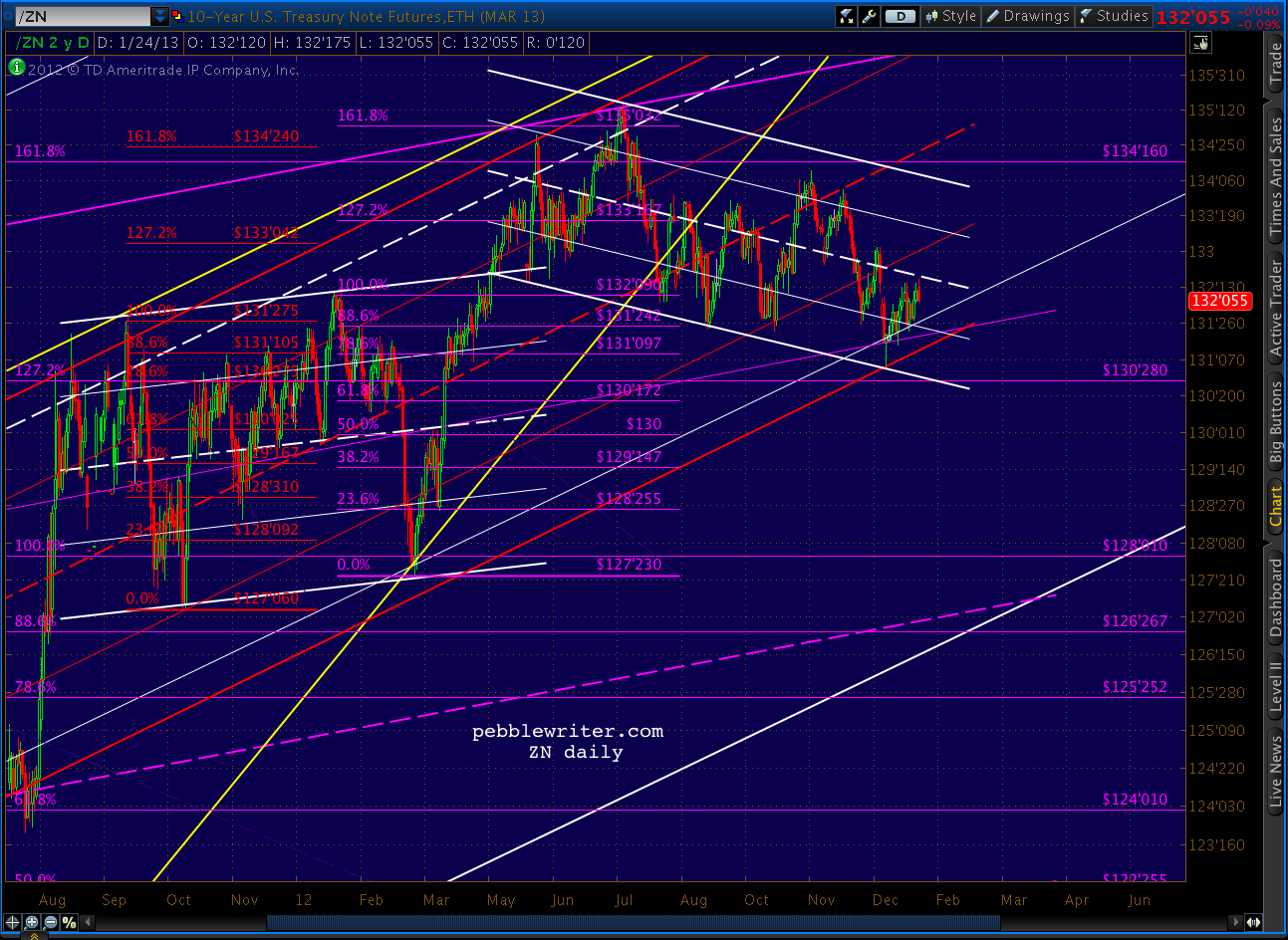
The close-up shows a potential channel since the most recent Crab Pattern reversal and the impact of the white 25% channel line.  The easiest call is for a bounce off this line as well as the small channel bottom.  If that occurs, the 138'170 level is in the cards.


Otherwise, the bottom of the white channel and the middle of the purple channel intersect at the 126-127 area (the purple .886 is 126'267 and the white .886 is 126'285) around the middle of March.

Wednesday, January 23, 2013

Checked the Agenda Lately?


With the market surpassing the recent 1474 highs, I am officially laying to rest the analog that did so well for us since last April.  This begs the question: "now what?"  There are three big issues hanging over the market right now:
    • earnings season --  AAPL in particular
    • the US budget/debt ceiling imbroglio
    • new highs justified?

Earnings

GOOG and IBM both gapped up this morning, but the earnings report most capable of moving the market -- AAPL -- comes after the close.  We'll take a fresh look at the AAPL chart later today.

Budget/Debt-Ceiling

In a few hours, the House will probably pass a measure to postpone the debt ceiling debate until May.  Reid and Obama have both said they're on board, so this appears to be a done deal.  If House Republicans don't fall in line, as occurred with "Plan B," the market will sell off precipitously.

If the bill passes, Congress is left with the "simple" matter of balancing the budget before the sequester sets in, knocking GDP back by a couple of percentage points and ensuring another  recession (or, extension of the current depending on your POV.)

New Highs

The market's strength caught many permabears off guard.   Many are now calling for new all-time highs for SPX. The 2007 high of 1576 is now only 84 points away, so a few good sessions could do it.

We'll take a fresh look, focusing on the harmonic and chart pattern picture as well as the financial establishment agenda.  Squeeze me?  The what? 

Talk all you want about random walks, CAPM, dividend discount models and Dow Theory.  But, like any other government-managed enterprise, the market is subject to the policy goals and needs of those who attempt to control it.

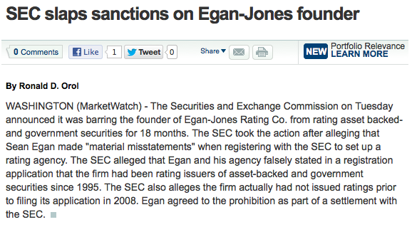
I know.  Even to my cynical ears, this sounds like the ranting of the tin-foil hat crowd.  But, consider the news on Egan-Jones yesterday.  This is one of the biggest stories of the month, yet predictably earned only this from WSJ/Marketwatch:


CNBC was slightly more generous, yet still presented only the SEC's side of the story.  It's a story that deserves to be told because it speaks volumes about the degree to which the market is presently being controlled.  And, I'm not just talking about quantitative easing, though I suppose we'd have to consider QE exhibit #1.

Last summer the market crashed 22%.  It was an analog (replay) of the 2007 top, so we saw it coming in plenty of time to profit quite handsomely.  But, it was a huge wake-up call for The Powers That Be (TPTB) or Plunge Protection Team, Wall Street Cabal -- whatever you want to call it.

With virtually unlimited power and unlimited resources, why couldn't they prevent something like that from happening?  More importantly, if the top was a replay of the 2007 top, might the rest of 2011 play out like 2008-2009?

It didn't, because they learned from the crash of July-August.  First, they tweaked the markets just enough to bust important chart patterns that were playing out.  Second, they tweaked the rules to provide for more time to contain any damage which might otherwise occur (circuit breakers, etc.)  Third, they attacked those who had "caused" the crash.

S&P CEO Deven Sharma was one of the first victims.  In the wake of the 2007 financial crisis, S&P was rightly pilloried for having pulled its punches -- particularly on mortgage and banking related debt.  This was no surprise to anyone who's ever worked on Wall Street, which pays for these supposedly unbiased views.

An infamous exchange between two S&P analysts in April 2007 aptly illustrates:
“BTW, that deal is ridiculous.”
“I know, right . . . model def(initely) does not capture half the risk.”
“We should not be rating it.”
“We rate every deal. It could be structured by cows and we would rate it.”
Imagine if Hollywood studios funded the reviews of their movies.  Would you care if they received thumbs up or down?  So, in August 2011 S&P found religion and bravely downgraded US debt.  Seventeen days later, Sharma was fired and replaced with the COO of Citibank, the bank whose continued existence relies on the absence of any future downgrades.

Egan-Jones beat S&P to the punch, downgrading US debt on July 16.   Two days later, the SEC’s Office of Compliance Inspections and Examinations called looking for information on the downgrade.

On October 12, Egan Jones was formally notified of a Wells Notice -- they were being investigated.  On April 24, the SEC filed a cease and desist order against Egan-Jones -- the only rating firm not on the take -- stating the action was “necessary for the protection of investors and in the public interest.”

The financial establishment's interests?  Sure.  But, to frame this obvious smack down as "in the public interest" is laughable alarming.  Egan-Jones was the one rating firm with the balls to point out the country's crumbling financial condition and stick to their guns.  Now they've been branded as deceitful, dangerous.  George Orwell spoke the truth in 1984:
"In a time of universal deceit, telling the truth is a revolutionary act."  
That other deep thinker, Jim Morrison, offered a similarly profound observation:
"Whoever controls the media controls the mind."
 The extent to which the market has been manipulated is deserving of its own post.  But, this Zerohedge article, forwarded by a member, is a great preview.

Okay, so I know what you're thinking: if the market is so heavily manipulated (and, presumably, insulated from downturns) why bother trying to beat it?  Simple.
  1. Chaos theory tells us they won't have enough fingers to plug every hole in the dike (TPTB have enacted similar "never again" strategy sessions after every crash.) 
  2. Even when things do run as programmed, we can still effectively capture enough significant swings in the markets often enough to boost returns and, more importantly, try to avoid huge downdrafts.
Over the very long-term, stocks return 8-10% -- depending on the time frame examined.  Unfortunately, most of us mortals are limited to 40-60 years of investing.  So, a 60% crash right before starting a business, buying a home or beginning retirement could be devastating.

So, we keep plugging away, letting the markets tell us where they want to go...while trying to get there first.

So, the question is "Now What?"  We'll start by looking at the harmonic picture, then AAPL and finally the agenda question. 

As detailed in our last review of all the recent tops, harmonic patterns are very likely to come into play. 

Tuesday, January 22, 2013

Ay, There's the Rube

Oil is often viewed as a proxy for economic health.  In a growing economy, energy consumption increases.  This increased demand generally pressures prices higher.  Likewise, a decline in oil prices often accompanies declining demand.

That's a greatly oversimplified view, of course.  It ignores such important issues such as Middle East tensions, weather and refinery anomalies, etc.
But, the most important of these external factors is the US dollar -- the currency by which oil is traded globally (for now.)

A weakening dollar is great for the many US companies that export overseas.  In general, it makes dollar denominated assets -- such as stocks, real estate, etc -- more attractive to overseas investors which helps the US attract and retain capital.

But, it makes foreign-sourced oil much more expensive.  This isn't an issue if you travel everywhere via America's world-class public transportation system.  But, it really sucks for the guy with a 3-ton SUV -- or anyone who consumes anything made overseas, for that matter.  Imports are about 18% of GDP.

So, what's a central banker to do?  Boost stocks and investment in US assets, and there's a pretty good chance you blow the budget of every American consumer.  (Of course, it only really affects those who eat and drive -- hey, buy a Chevy Volt already!)

Boost the dollar to make gas and food more affordable for the 50 million Americans living in poverty (1 in 5 children, 2 in 5 African American children), and you risk a true disaster -- a stock market decline.

Never fear... Bernanke and his fellow Guardians of the American Dream know whose bread to butter.

The chart below shows how crude light, the US dollar and the S&P 500 correlated over the past seven years.  In 2006 and 2007, oil and the stock market soared pretty much in sync while the dollar took it on the chin.  When SPX topped in late 2007, oil kept right on soaring -- because the dollar was still plunging.  Nationwide, gas hit $4.12/gallon in the summer of 2008.


We're all conditioned to think of dollar strength as a function of risk off.  But, as the financial crisis worsened, the dollar couldn't catch a bid.  Money fled to the euro, the swiss franc, the sterling -- anywhere but the dollar. There were several best-sellers on bookstore (remember those? shelves that advised putting every last cent into the euro.

From October 2007, when SPX peaked, until July 2008, stocks and the dollar moved pretty much in tandem.  But, as euro zone problems became more apparent, the dollar finally bottomed.  In August, as stocks began sliding again, the dollar finally took off.  Now deemed a safe haven, DX soared 27% by March of 2009, while stocks shed another 54% in value (58% in all.)

Of course, this did a number on oil -- already reeling from declining global demand.  CL plunged an astounding 78% in only six months -- from 147 to 33.  Fortunately for the stock market -- and especially the oil industry -- Ben Bernanke came to the rescue.  The first round of QE was a resounding success and both promptly reversed.

In the first three months alone, CL more than doubled to 73.  SPX added on a respectable 44%.  And the dollar took one for the team, shedding an initial 13% on its way to an 18% loss.

So, why the history lesson?  By now most of you have noticed a slight discrepancy over the past 3 1/2 years.  Oil and the dollar have formed triangles.  They've had their ups and downs, but in general the highs have been getting lower and the lows getting higher.  I use the term "coiling" because eventually prices won't be able to compress anymore.

This pent-up energy will eventually be released in the form of sharply higher or lower prices, though it won't necessarily happen tomorrow.   Both have drawn close to one side of the pattern, but there's still plenty of room for a reversal.

Oil, if it doesn't suddenly shoot higher, will probably bounce back down.  Likewise, the dollar is poised to bounce higher.


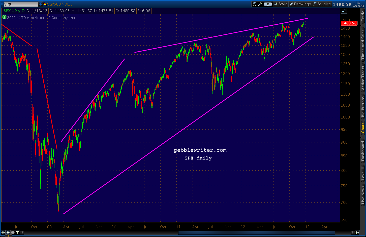
Stocks, on the other hand, have made a series of higher highs and higher lows in what's known as a rising wedge.  These patterns also can't last forever, and they almost always resolve to the downside.
Prices are much closer to the upper bound than the lower, which also suggests the next major move will be lower.  In fact, when rising wedges break down, they typically target their origin. Needless to say, a return to 2009 or even 2010 prices would be a huge blow to the rosy scenario TPTB are crafting.


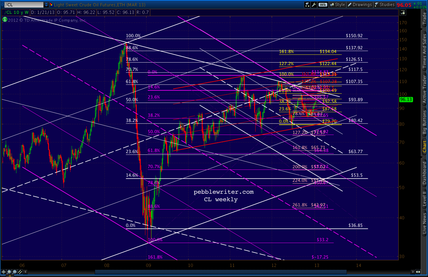
Does oil offer any hints as to which way prices are likely to go?   I'm drawn to a few periods in particular.  From June 2009 to May 2010, oil gained 19% compared to SPX's 27%.  Yet, they both shed roughly 20% in the May - June 2010 correction.

We had another round of QE, which collapsed the dollar and sent stocks up 36% and oil up 70% through May 2011.  This time, SPX corrected 22% and oil 35% (through Oct 2011.)

At that point, CL sold off strongly -- dropping 23% through the end of June.  SPX, however, lagged.  It lost 8%, then promptly regained 90% of it in the next three weeks (compared to CL's 40% retracement.)  When the slide continued, however, SPX caught up -- in spades.

It lost 80% of its gains from June 2010, while CL only lost about half that.  SPX then went on to make three new highs in a row, adding 38% through today's close.

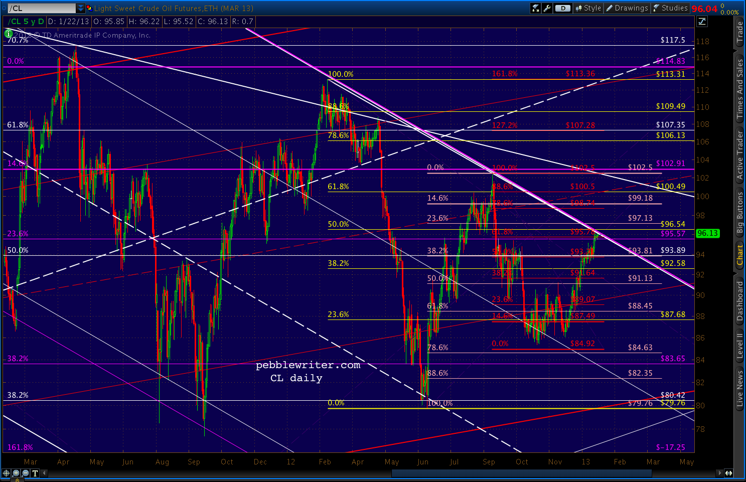
CL managed an 88% retracement of its May-October losses for a 47% gain through Feb 2012, and has made two lower highs (each a 61.8% retracement of the previous high) since then.  Total gain from Oct 2011: 27%.  And, it's been a fairly neutral currency market.

I can't help wondering what the oil and currency markets know that the stock market doesn't.  A look at the CL charts indicates more downside.  Will SPX again play catch-up?

Even ignoring what I suspect about the dollar and equity markets, CL presents a bearish picture.


Whether it breaks down or out, CL is obviously at a turning point.  We'll keep an eye on it...


Tuesday, January 15, 2013

AAPL: Flirting with Disaster

Not since the summer of 1666, as young Zack Newton sat pondering gravity, has so much attention been paid to a falling apple.

Should we care about AAPL's deteriorating powers of levitation?  The $200/share drop since its September highs, especially on the heels of a new dividend and share buyback program, has been unnerving.  But, if you invest based on fundamentals, it's a solid company selling at 11 times earnings and a 62% 5-year CAGR -- which happens to be on sale.

If you pay attention to chart patterns, however, AAPL is flirting with disaster.  It's a mere point or two from completing a Head & Shoulders pattern that targets the low 300's. [To read about how H&S patterns work, click HERE.]


Even if you don't give a darn about chart patterns, know that many other investors do.  The four tags of the white trend line (the neckline) in the past month are ample proof.  So are the many previously completed patterns that weighed on AAPL.

In January 2008, AAPL completed a H&S pattern that saw share prices drop from 200 to 115 in a few short weeks.


Buyers at 115 were rewarded with a rebound to 190, then punished by a plunge to 78 as the rebound completed a right shoulder in a much larger H&S pattern.


Not every pattern plays out, of course.  Consider the pattern below from 1993-1994 -- a well-formed pattern that targeted much lower prices.


Instead of a big drop off, AAPL found channel support before much damage was done.  Prices rebounded to new highs where they formed a new pattern (in white) which did play out.


Like any other chart pattern, H&S patterns don't occur in a vacuum.  Channels and harmonics often influence the ultimate outcome.

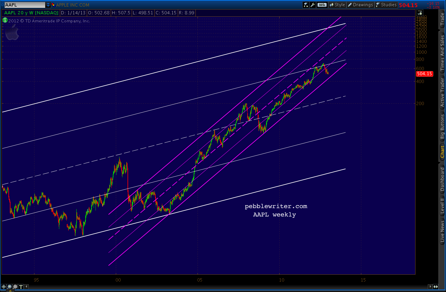
The channel that saved the day in 1995 is still with us, though it most recently offered resistance to higher prices instead of a floor.  It's the white channel in the chart below.

The much smaller, steeply rising purple channel, on the other hand, has kept prices rising -- putting AAPL back on track after two significant sell-offs.  It's currently around 445 -- within a few points of the Crab Pattern 1.618 extension of the failed mid-November rally.


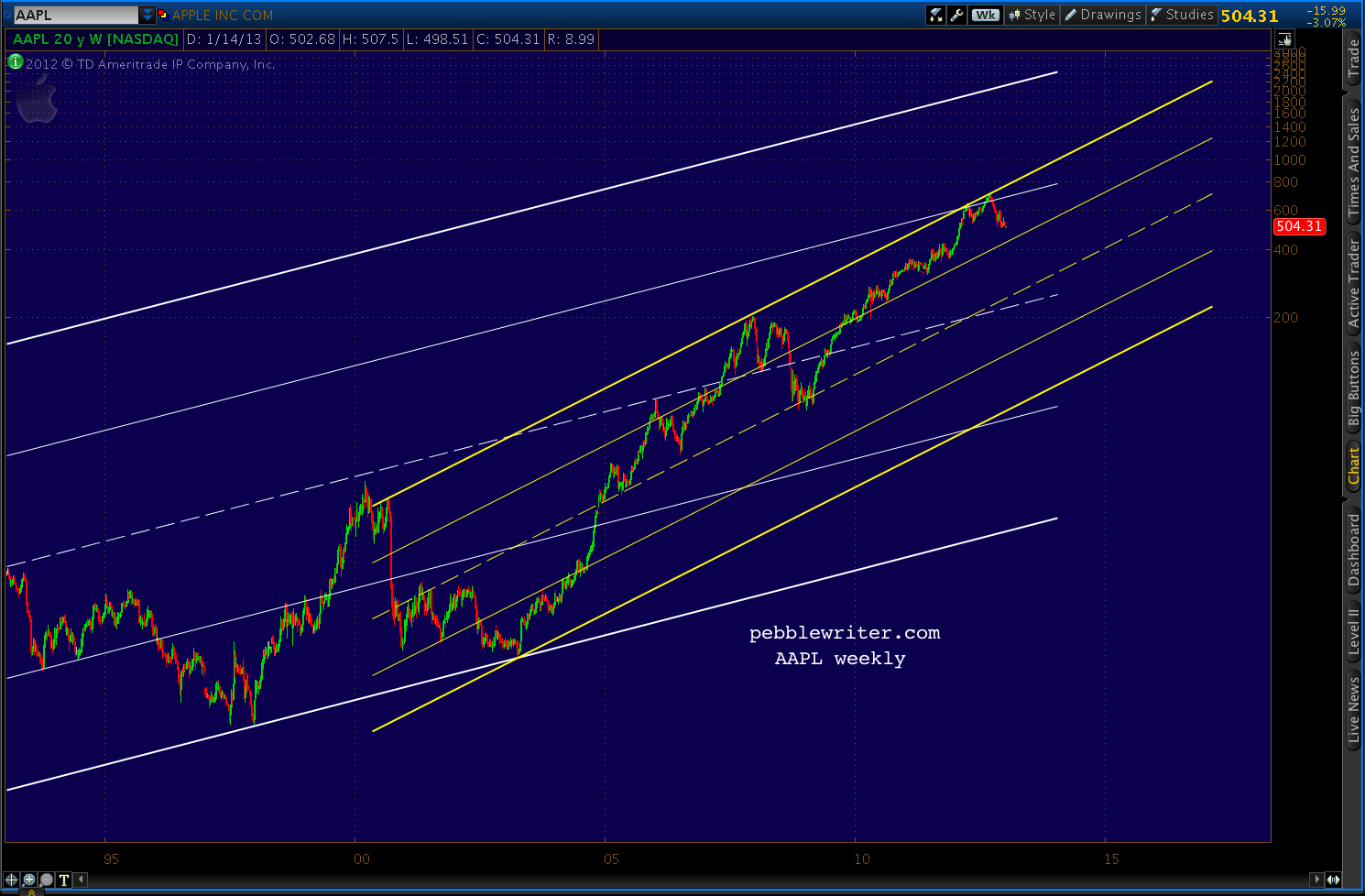
If the current H&S pattern plays out and AAPL drops below the purple channel support, there's another, less bullish channel that could come into play -- seen in yellow below.


The next lower channel line is in the vicinity of the purple line referenced above: 430 or so.  But, if gravity takes hold, mid-line support doesn't show up until around 300.  Ouch.


There are a dozen or more other patterns that could easily influence AAPL's future. There are also many fundamental events that could strengthen the price.

The company's current share buyback scheme, for instance, is only $10 billion -- about the average daily volume at $500/share.  But, with $120 billion in cash on the books and virtually no debt, the company could easily expand it to a more meaningful level.

If this most widely held stock were to crash, could the rest of the market be far behind?  I think there's little question it would. Such an outcome would spell disaster for the bullish story line that TPTB have been working so diligently to construct.

Might they join company insiders in supporting the stock here at 500?  It would be a lot cheaper than another round of QE and, in the end, probably more effective.

Stay tuned.

*  *  *  *  *  *  *  *

reprinted from pebblewriter.com