A glance at the chart below tells the 2007 story. NDX followed the same general pattern as SPX, but failed to spike as much in July. Only in October did reluctant investors finally forget the past, bidding it up at a much faster clip than SPX. Between its July and October peaks, for instance, SPX gained 20 points (1.2%). In the same period, NDX gained 179 points (8.6%).

When SPX reached its all-time high on October 11, it was tired. Twenty points in 3 months is a lot of effort for little reward. But NDX, playing catch up, still had plenty of momentum -- gaining another 108 points before finally peaking two weeks later on October 31 after making three higher highs in a row.
Many investors no doubt wondered, as NDX hit 2239 on Oct 31, whether SPX would join it in making a higher high. It was only 27 points away from completing a massive Inverse Head & Shoulders pattern that might have sent it up 190 points. Instead, SPX made its first lower high at 1553 (spitting distance from its first topping pattern high of 1556 on 7/19). It would go on to make successive lower highs, eventually completing a traditional H&S pattern and tumbling 58%.
In retrospect, NDX's peak -- coming two weeks after SPX's -- was a great indicator of bearish capitulation. Understandably reluctant investors, by finally turning euphoric, marked the top in a way that would make Prechter proud. The divergence between NDX's higher high and SPX's lower high was a great warning sign.
We then looked at the 2011 comparisons between NDX and SPX. The divergence between three successive highs (NDX) and a potential H&S (SPX) was striking. It was one of several factors that convinced me that the top had been made two weeks prior [see: Merry Christmas and Pulling the Trigger] and that we'd already started down.
Big deal. We already had the 250-pt plunge on SPX and 400-pt annihilation of NDX. Ancient history. Isn't it? (Regular readers know that all such questions are rhetorical, serving only as dramatic props; irregular readers are on their own.)
I've blogged ad nauseum about the similarities between 2007 and 2011, as well as some very striking similarities between Feb-May 2011 and the past five weeks.
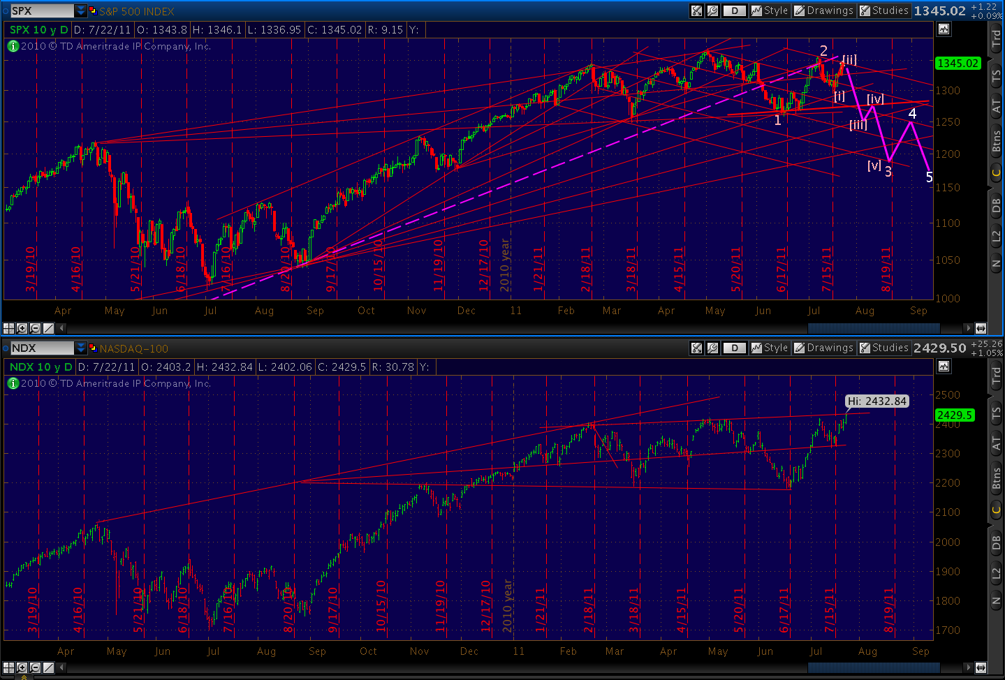
So... here's another little chart worth considering.

TPTB would have us believe that Fed governors and Troiksters have things well in hand. That in spite of impending defaults, trillions in debt, unending unemployment and plunging home prices, these will be the best of times for bulls.

Take a quick look at this rising wedge, completing a possible Butterfly pattern at the 1.272 Fib level (also possibly a Crab, which would have potential to the 1.618 at 2364.)
If we back out a bit, it looks even better as a bearish Gartley that nailed its .786 Fib today.

In my opinion, this new high by NDX, combined with the all-time high for AAPL and significant weakness/divergence with SPX, is yet another clear sign of bearish capitulation. Spring of hope or Winter of despair? Stay tuned.
No comments:
Post a Comment